In 2007 developers only had to design user interfaces for single screen size and resolution (that of the first generation iPhone). However, considering the range of iOS devices, screen sizes, and resolutions available today, designing a single user interface layout to target the full range of device configurations now seems a much more daunting task.
Although eased to some degree by the introduction of Auto Layout, designing a user interface layout that would work on both iPhone and iPad device families (otherwise known as an adaptive interface) typically involved creating and maintaining two storyboard files, one for each device type.
iOS 9 and Xcode 7 introduced the concepts of trait variations and size classes, explicitly intended to allow a user interface layout for multiple screen sizes and orientations to be designed within a single storyboard file. In this chapter of iOS 16 App Development Essentials, the concept of traits and size classes will be covered together with a sample app demonstrating how to use them to create an adaptive user interface.
Understanding Traits and Size Classes
Traits define the features of the environment an app is likely to encounter when running on an iOS device. Traits can be defined both by the device’s hardware and how the user configures the iOS environment. Examples of hardware-based traits include hardware features such as the range of colors supported by the device display (also referred to as the display gamut) and whether or not the device supports features such as 3D Touch. The traits of a device that are dictated by user configuration include the dynamic type size setting and whether the device is configured for left-to-right or right-to-left text direction.
Arguably the most powerful trait category, however, relates specifically to the size and orientation of the device screen. Therefore, these trait values are referred to as size classes.
Size classes categorize the screen areas an app user interface will likely encounter during execution. Rather than represent specific screen dimensions and orientations, size classes represent width (w) and height (h) in terms of being compact (C) or regular (R).
All iPhone models in portrait orientation are represented by the compact width and regular height size class (wC hR). However, when smaller models such as the iPhone SE are rotated to landscape orientation, they are considered to be of compact height and width (wC hC). On the other hand, larger devices such as iPhone Pro and Pro Max models in landscape orientation are categorized as compact height and regular width (wR hC).
Regarding size class categorization, all iPad devices (including the iPad Pro) are classified as regular height and width (wR hR) in both portrait and landscape orientation. In addition, a range of different size class settings are used when apps are displayed on the iPad using multitasking, a topic covered in detail in the A Guide to Multitasking in iOS 12 chapter of this book.
Size Classes in Interface Builder
Interface Builder in Xcode 14 allows different Auto Layout constraints to be configured for different size class settings within a single storyboard file. In other words, size classes allow a single user interface file to store multiple sets of layout data, with each data set targeting a particular size class. At runtime, the app will use the layout data set for the size class that matches the device and prevailing orientation on which it is executing, ensuring that the user interface appears correctly.
By default, any layout settings configured within the Interface Builder environment will apply to all size classes. Only when trait variations are specifically specified will the layout configuration settings differ between size classes.
Customizing a user interface for different size classes goes beyond the ability to configure different Auto Layout constraints for different size classes. Size classes may also be used to designate which views in a layout are visible within each class and which version of a particular image is displayed to the user. A smaller image may be used when an app is running on an iPhone SE, for example, or extra buttons might be made to appear to take advantage of the larger iPad screen.
Enabling Trait Variations
Xcode enables trait variations by default for new Xcode projects. This setting can be viewed and changed by opening the Main storyboard file, selecting a scene, and displaying the File inspector as illustrated in Figure 23-1:
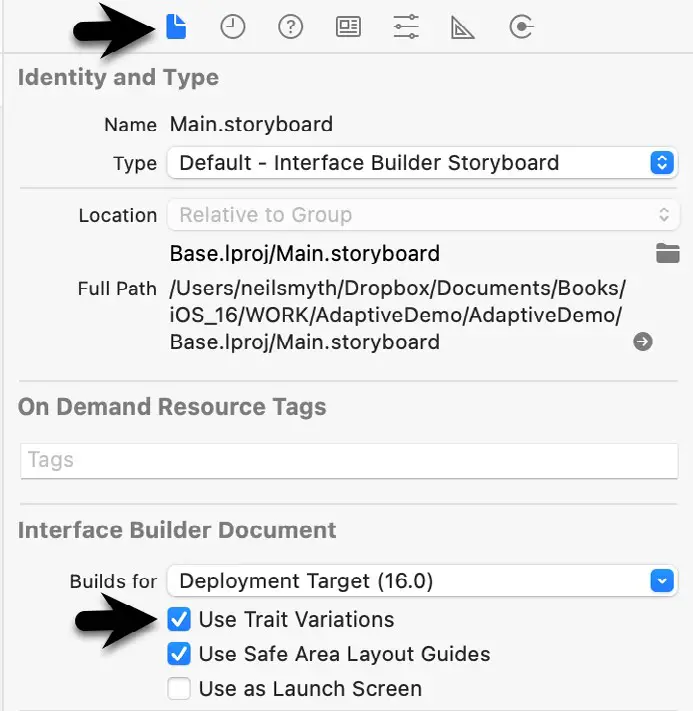
Figure 23-1
Setting “Any” Defaults
When designing user interfaces using size classes, there will often be situations where particular Auto Layout constraints or view settings will be appropriate for all size classes. Rather than configure these same settings for each size class, these can be configured within the Any category. Such settings will be picked up by default by all other size classes unless specifically overridden within those classes.
Working with Trait Variations in Interface Builder
A key part of working with trait variations involves using the device configuration bar. Located along the bottom edge of the Interface Builder storyboard canvas is an indicator showing the currently selected device, marked A in Figure 23-2:

Figure 23-2
Clicking on the current setting (A) in the status bar will display the device configuration menu shown in Figure 23-3, allowing different iOS device types to be selected:
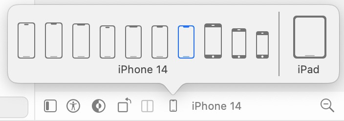
Figure 23-3
Note that when an iPad model is selected, the button marked B is enabled so that you can test layout behavior for multitasking split-screen and slide-over modes. In addition, the device’s orientation can be switched between portrait and landscape using the button (C).
When you make device and orientation selections from the configuration bar, the scenes within the storyboard canvas will resize to match precisely the screen size corresponding to the selected device and orientation. This provides a quick way to test the adaptivity of layouts within the storyboard without compiling and running the app on different devices or emulators.
Attributes Inspector Trait Variations
Regardless of the current selection in the device configuration panel, any changes made to layouts or views within the current storyboard will, by default, apply to all devices and size classes (essentially the “Any” size class). Trait variations (in other words, configuration settings that apply to specific size classes) are configured in two ways.
The first option relates to setting size-specific properties such as fonts and colors within the Attributes Inspector panel. Consider, for example, a Label view contained within a storyboard scene. This label is required to display text at a 17pt font size for all size classes except for regular width and height, where a 30pt font is needed. Reviewing the Attributes Inspector panel shows that the 17pt font setting is already configured, as shown in Figure 23-4:
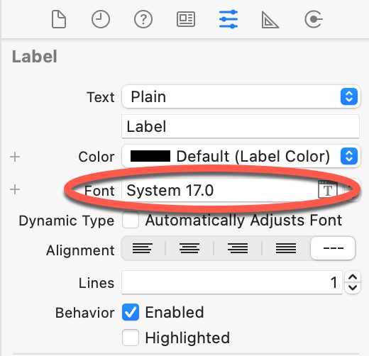
Figure 23-4
The absence of any size class information next to the attribute setting tells us that the font setting corresponds to the any width, any height, any gamut size class and will be used on all devices and orientations unless overridden. To the left of the attribute field is a + button, as indicated in Figure 23-5:

Figure 23-5
This is the Add Variation button which, when selected, displays a panel of menus allowing size class selections to be made for a trait variation. To configure a different font size for regular height, regular width, and any gamut, for example, the menu selections shown in Figure 23-6 would need to be made:
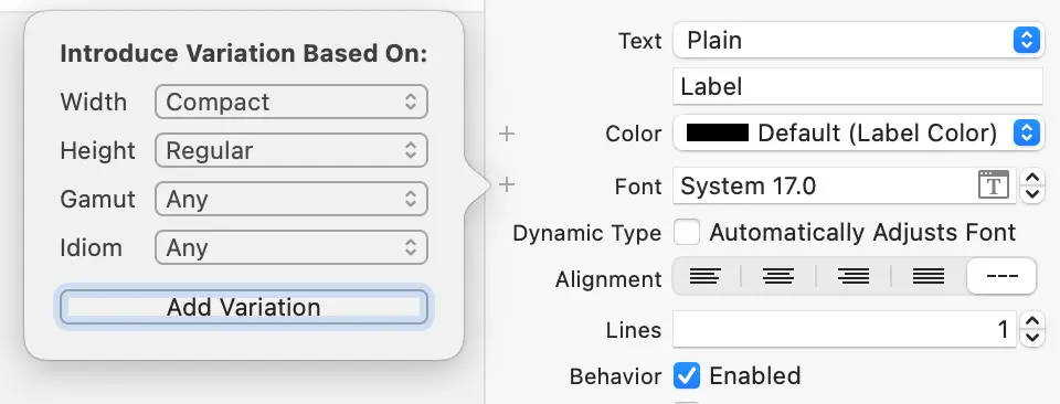
Figure 23-6
Once the trait configuration has been added, it appears within the Attributes Inspector panel labeled as wR hR and may be used to configure a larger font for regular width and height size class devices:

Figure 23-7
Using Constraint Variations
Layout size and constraint variations are managed using the Size inspector, which is accessed using the button marked A in Figure 23-8:
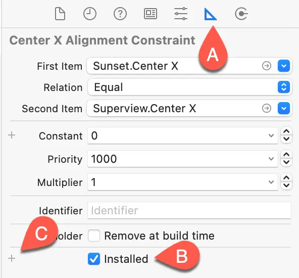
Figure 23-8
The Size inspector will update to reflect the currently selected object or constraint within the design layout. Constraints are selected either by clicking on the constraint line in the layout canvas or by making selections within the Document outline panel. In Figure 23-9, for example, a centerX constraint applied to a Label is selected within Interface Builder:

Figure 23-9
The area marked B in Figure 23-8 above contains a list of variations supported by the currently selected constraint (in this example, only the default constraint is installed, which will apply to all size classes). As demonstrated later in this chapter, we can add additional variations by clicking on the + button (C) and selecting the required class settings as outlined above when working with fonts. Once the new variation has been set up, the default variation must be disabled so that only the custom variation is active. In Figure 23-10, for example, a Label width constraint variation has been configured for the wR hR size class:
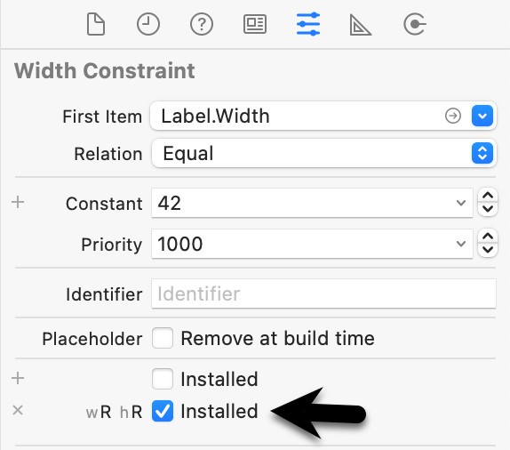
Figure 23-10
If we needed a different width for compact width, regular height devices, we would add a second width constraint to our Label and configure it with a wC hR variation containing the required width value. Then, the system will select the appropriate width constraint variation for the current device when the app runs.
An Adaptive User Interface Tutorial
The remainder of this chapter will create an adaptive user interface example. This tutorial aims to create a straightforward adaptive layout that demonstrates each of the key features of trait variations, including setting individual attributes, using the vary for traits process, and implementing image asset catalogs in the context of size classes. Begin by creating a new Xcode iOS app project named AdaptiveDemo with the language option set to Swift.
Designing the Initial Layout
The iPhone 14 in portrait orientation will serve as the base layout configuration for the user interface, so begin by selecting the Main.storyboard file and ensuring that the device configuration bar currently has the iPhone 14 device selected.
Drag and drop a Label view so that it is positioned in the horizontal center of the scene and slightly beneath the top edge of the safe area of the view controller scene. With the Label still selected, use the Align menu to add a constraint to center the view horizontally within the container. Using the Add New Constraints menu, set a Spacing to nearest neighbor constraint on the top edge of the Label using the current value and with the Constrain to Margins option enabled.
Double-click on the Label and change the text to read “A Sunset Photo”. Next, drag and drop an Image View object from the Library panel to be positioned beneath the Label and centered horizontally within the scene.
Resize the Image View so that the layout resembles that illustrated in Figure 23-11:
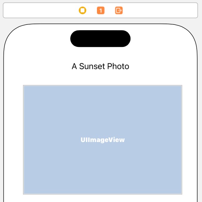
Figure 23-11
With the Image View selected, display the Align menu and enable the option to center the view horizontally within the container, then use the Add New Constraints menu to add a nearest neighbor constraint on the top edge of the Image View with the Constrain to Margins option disabled and to set a Width constraint of 320:
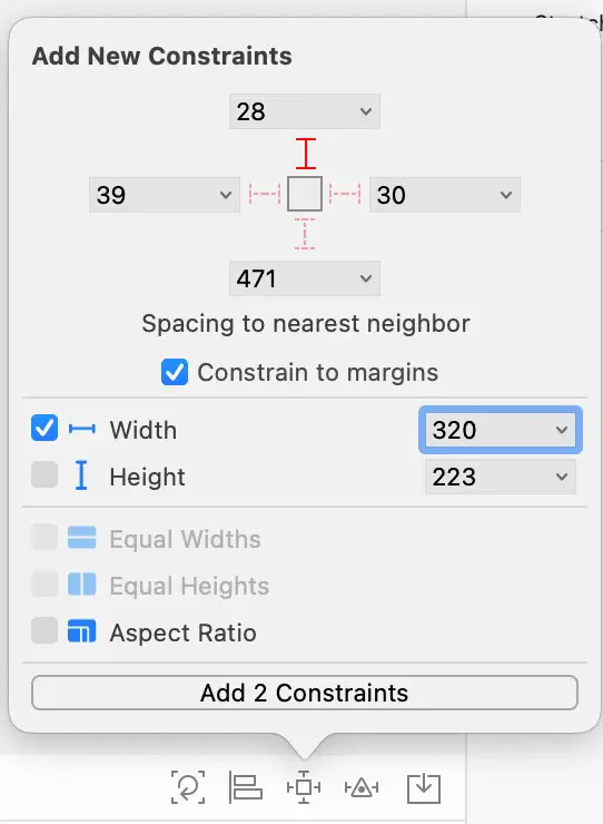
Figure 23-12
Ctrl-click and drag diagonally across the Image View, as shown in Figure 23-13. On releasing the line, select Aspect Ratio from the resulting menu.
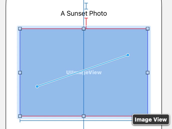
Figure 23-13
If necessary, click the Update Frames button in the status bar to reset the views to match the constraints.
Adding Universal Image Assets
The tutorial’s next step is adding some image assets to the project. The images can be found in the adaptive_ images directory of the code samples download, which can be obtained from:
https://www.ebookfrenzy.com/retail/ios12/
Within the project navigator panel, locate and click on the Assets entry and click on the + button located in the panel’s bottom left-hand corner and select the Image Set option. Next, double-click on the new image set, which will have been named Image, and rename it to Sunset.
Locate the [email protected] file in a Finder window and drag and drop it onto the 2x image box as illustrated below:

Figure 23-14
Return to the Main.storyboard file, select the Image View and display the Attributes Inspector panel. Next, click the down arrow to the right of the Image field and select Sunset from the resulting menu. The Image View in the view controller canvas will update to display the sunset image from the asset catalog.
Switch between device types and note that the same image is used for all size classes. The next step is to add a different image to be displayed in regular-width size class configurations.
Once again, select Assets from the project navigator panel and, with the Sunset image set selected, display the Attributes Inspector and change the Width Class attribute to Any & Compact. An additional row of image options will appear within the Sunset image set. Once again, locate the images in the sample source code download, this time dragging and dropping the [email protected] file onto the 2x image well in the compact row, as shown in Figure 23-15:
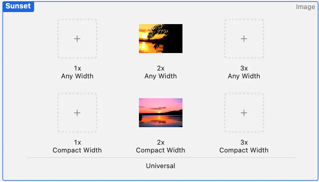
Figure 23-15
Return to the Main.storyboard file and verify that different sunset images appear when switching between compact and regular width size class configurations.
Increasing Font Size for iPad Devices
The next step in the tutorial is to add some trait variations that will apply when the app runs in regular width and regular height size class device configurations (in other words, when running on an iPad). The first variation is to use a larger font on the Label object.
Begin by selecting the Label object in the scene. Next, display the Attributes Inspector panel and click on the + button next to the font property, as illustrated in Figure 23-6 above. Select the Regular Width | Regular Height menu settings from the resulting menu and click on the Add Variation button. Within the new wR hR font attribute field, increase the font size to 35pt. Using the device configuration bar, test that the new font applies only to iPad device configurations.
Adding Width Constraint Variations
The next step is to increase the Image View size when the app encounters an iPad device size class. Since the Image View has a constraint that preserves the aspect ratio, only the width constraint needs to be modified to achieve this goal.
Earlier in the tutorial, we added a width constraint to the Image view that is currently being used for all size classes. The next step, therefore, is to adjust this constraint so that it only applies to compact width devices. To do this, select the width constraint for the Image view in the Document outline as shown below:
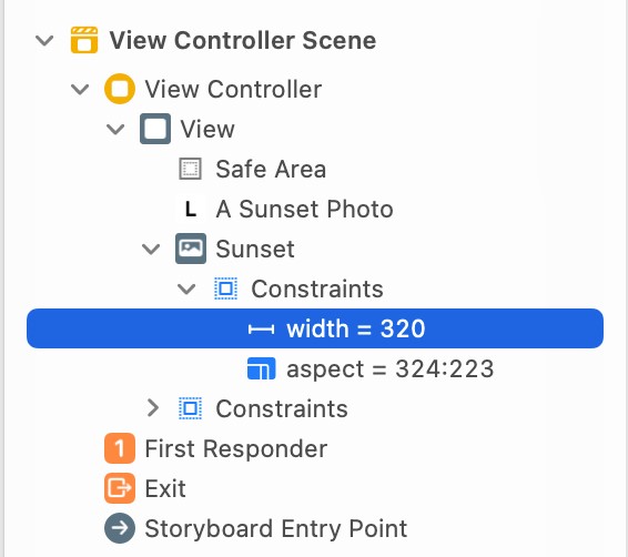
Figure 23-16
With the constraint selected, display the Size inspector, click on the button marked C in Figure 23-8 above and add a new compact width, regular height variation. Once the variation has been added, disable the default variation so that only the new variation is installed:
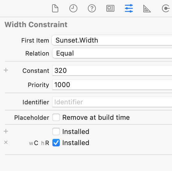
Figure 23-17
Now that we have a width constraint for compact width devices, we need to add a second width constraint to the Image view for regular width size classes. Select the Image view in the layout and use the Add New Constraints menu to add a width constraint with a value of 600:
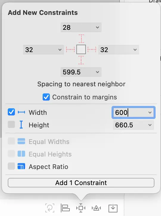
Figure 23-18
Locate this new width constraint in the Document outline and select it as outlined in Figure 23-19:
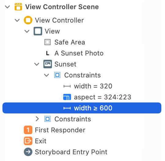
Figure 23-19
With the constraint selected, display the Size inspector, add a regular width, regular height variation and disable the default variation. If the Relation field is set to Greater Than or Equal to, change it to Equal:
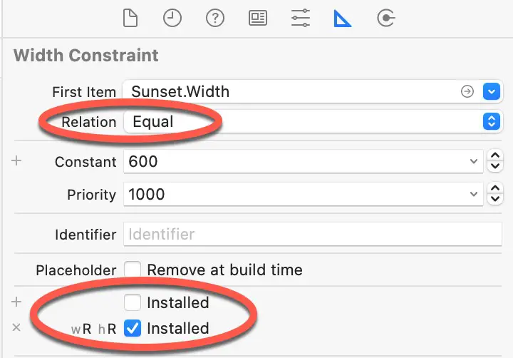
Figure 23-20
Testing the Adaptivity
Use the device configuration bar to test a range of size class permutations. Assuming that the adaptivity settings are working, a larger font and a larger, different image should appear when previewing iPad configurations. Use the device configuration bar to test a range of size class permutations. Assuming that the adaptivity settings are working, a larger font and a larger, different image should appear when previewing iPad configurations.
Before continuing to the next chapter, take some time to experiment by adding other variations, for example, to adjust the image size for smaller iPhone devices in landscape orientation (wC hC).
Summary
The range of iOS device screen sizes and resolutions is much more diverse than when the original iPhone was introduced in 2007. Today, developers need to be able to target an increasingly wide range of display sizes when designing user interface layouts for iOS apps. With size classes and trait variations, it is possible to target all screen sizes, resolutions, and orientations from within a single storyboard. This chapter has outlined the basics of size classes and trait variations and worked through a simple example user interface layout designed for both the iPad and iPhone device families.
