As we already know from the previous chapters, one of the ways that Compose can render user interface layouts quickly and efficiently is by limiting each composable to being measured only once during a recomposition operation. Situations sometimes arise, however, where a parent composable needs to know size information about its children before they are measured as part of the recomposition. You might, for example, need the width of a Column to match that of its widest child. Although a parent cannot measure its children, size information may be obtained without breaking the “measure once” rule by making use of intrinsic measurements.
Intrinsic measurements
A parent composable can obtain sizing information about its children by accessing the Max and Min values of the Compose IntrinsicSize enumeration. IntrinsicSize provides the parent with information about the maximum or minimum possible width or height of its widest or tallest child. This allows the parent to make sizing decisions based on the sizing needs of its children. The following code, for example, sets the height of a Row composable based on intrinsic size information:
Row(modifier = modifier.height(IntrinsicSize.Min)) {
.
.
}Code language: Kotlin (kotlin)
When this composable is rendered, the height of the Row will be set to the minimum possible height needed to display its tallest child. Similarly, the following code configures the width of a Column to the maximum possible width of its widest child:
Column(modifier = modifier.width(IntrinsicSize.Max)) {
.
.
}Code language: Kotlin (kotlin)
In the absence of modifiers to the contrary, a layout composable such as a Row or Column will typically be sized to occupy all of the space made available to it by its parent. By making use of IntrinsicSize, these composables can instead be sized to match the space requirements of their children. As we will see in the following example project, this becomes particularly useful when one or more children are subject to dynamic size changes.
Max. vs Min. Intrinsic Size measurements
The IntrinsicSize enumeration provides access to both maximum and minimum measurements. The difference between these two values needs some explanation. All visible composables need space on the device display in which to render their content, and many can adapt to changes in the amount of space available. This concept is, perhaps, best described using the Text composable as an example. A Text composable displaying a single line of text has a maximum width equivalent to the length of text it is displaying. This equates to the IntrinsicSize Max value:
 |
You are reading a sample chapter from an old edition of the Jetpack Compose Essentials book. Purchase the fully updated Jetpack Compose 1.7 Essentials edition of this book in eBook or Print format. The full book contains 67 chapters and over 700 pages of in-depth information. Buy the full book now in Print or eBook format. Learn more. |

Figure 31-1
The Text component is, however, also able to display multi-line text. This means that the same line of text could potentially be placed on multiple lines, considerably reducing the width required to display the content. Assuming there are no restrictions on height, the minimum width required by a Text composable could be as narrow as the length of the longest word in the text string. This value equates to the IntrinsicSize Min value:
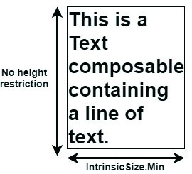
Figure 31-2
As indicated in the above diagram, this example IntrinsicSize.Min value assumes that no height constraints have been applied to the Text component. In the presence of a height restriction, Compose would arrive at a different minimum intrinsic width measurement:
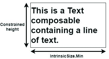
Figure 31-3
 |
You are reading a sample chapter from an old edition of the Jetpack Compose Essentials book. Purchase the fully updated Jetpack Compose 1.7 Essentials edition of this book in eBook or Print format. The full book contains 67 chapters and over 700 pages of in-depth information. Buy the full book now in Print or eBook format. Learn more. |
About the example project
When the project is complete it will consist of a Text composable, colored rectangular Box and custom TextField. The objective is for the text entered into the TextField to appear in the Text component. As text is typed, the width of the Box, which will be positioned directly beneath the Text component, will adjust so that it matches the width of the displayed text.
This will be achieved by placing the Text and Box components within a Column, the width of which will be defined using the IntrinsicSize measurements of its children.
Creating the IntrinsicSizeDemo project
Launch Android Studio and select the New Project option from the welcome screen. Within the new project dialog, choose the Empty Compose Activity template and click on the Next button.
Enter IntrinsicSizeDemo into the Name field and specify com.example.intrinsicsizedemo as the package name. Before clicking on the Finish button, change the Minimum API level setting to API 26: Android 8.0 (Oreo). Within the MainActivity.kt file, delete the Greeting function and add a new empty composable named MainScreen:
@Composable
fun MainScreen() {

}Code language: Kotlin (kotlin)
Next, edit the onCreateActivity() method and DefaultPreview function to call MainScreen instead of Greeting.
 |
You are reading a sample chapter from an old edition of the Jetpack Compose Essentials book. Purchase the fully updated Jetpack Compose 1.7 Essentials edition of this book in eBook or Print format. The full book contains 67 chapters and over 700 pages of in-depth information. Buy the full book now in Print or eBook format. Learn more. |
Creating the custom text field
The custom text field will need to accept as parameters the state variable used to store the current text and an event handler reference to be called for each user keystroke. Remaining within the MainActivity.kt file, add a new composable with these features named MyTextField:
.
.
import androidx.compose.material.TextField
.
.
@Composable
fun MyTextField(text: String, onTextChange : (String) -> Unit) {

    TextField(
        value = text,
        onValueChange = onTextChange
    )
}Code language: Kotlin (kotlin)
Before moving on to the next step, take this opportunity to add the text state variable and event handler to the MainScreen function as follows:
.
.
import androidx.compose.runtime.*
.
.
@Composable
fun MainScreen() {

    var textState by remember { mutableStateOf("") }

    val onTextChange = { text : String ->
        textState = text
    }
.
.
}Code language: Kotlin (kotlin)
Adding the Text and Box components
A Column now needs to be added to the MainScreen function containing both the Text and Box components. Continue editing the MainActivity.kt file to add these composables:
.
.
import androidx.compose.foundation.background
import androidx.compose.foundation.layout.*
import androidx.compose.ui.graphics.Color
import androidx.compose.ui.unit.dp

.
.
@Composable
fun MainScreen() {

    var textState by remember { mutableStateOf("") }

    val onTextChange = { text : String ->
        textState = text
    }

    Column {
        Text(
            modifier = Modifier
                .padding(start = 4.dp),
            text = textState
        )

        Box(Modifier.height(10.dp).fillMaxWidth().background(Color.Blue))
    }
}Code language: Kotlin (kotlin)
Note that the Box is configured to use the full width of the parent Column. Later we will use the intrinsic width measurement to make sure the Column is only wide enough to contain the Text composable.
Adding the top-level Column
The final step before we perform an initial test is to embed the Column added above within another Column together with the custom text field as outlined below. Since this is the top-most Column in the component hierarchy, we will refer to it as the “top-level” column:
 |
You are reading a sample chapter from an old edition of the Jetpack Compose Essentials book. Purchase the fully updated Jetpack Compose 1.7 Essentials edition of this book in eBook or Print format. The full book contains 67 chapters and over 700 pages of in-depth information. Buy the full book now in Print or eBook format. Learn more. |
@Composable
fun MainScreen() {

    var textState by remember { mutableStateOf("") }

    val onTextChange = { text : String ->
        textState = text
    }

    Column(Modifier.width(200.dp).padding(5.dp)) {
        Column {
            Text(
                modifier = Modifier
                    .padding(start = 4.dp),
                text = textState
            )
            Box(Modifier.height(10.dp).fillMaxWidth().background(Color.Blue))
        }
        MyTextField(text = textState, onTextChange = onTextChange)
    }
}Code language: Kotlin (kotlin)
Testing the project
Using either an emulator or device, run the app and enter some text into the TextField as shown in Figure 31-4:

Figure 31-4
Note that text appears in the Text composable as it is typed, but that the Box extends to the width of the top-level Column instead of matching the text width.
Applying IntrinsicSize.Max measurements
All that is required to resolve the current problem is to configure the Column containing the Text and Box so that its width is based on the maximum intrinsic size measurement of its children. Modify the Column declaration so that it now reads as follows:
.
.
   Column(Modifier.width(200.dp).padding(5.dp)) {
        Column(Modifier.width(IntrinsicSize.Max)){
.
.Code language: Kotlin (kotlin)
Test the app again, and verify that the width of the Box now matches the text width as it is typed. In fact, even as text is deleted, the Box width updates accordingly. This is because the width of the parent Column is changing on each recomposition as characters are typed or deleted.
 |
You are reading a sample chapter from an old edition of the Jetpack Compose Essentials book. Purchase the fully updated Jetpack Compose 1.7 Essentials edition of this book in eBook or Print format. The full book contains 67 chapters and over 700 pages of in-depth information. Buy the full book now in Print or eBook format. Learn more. |

Figure 31-5
Applying IntrinsicSize.Min measurements
Now that we have seen the effect of the minimum IntrinsicSize measurement on the Column parent, we are ready to explore the use of the minimum measurement. Edit the Column declaration so that it now uses IntrinsicSize. Min as follows:
.
.
   Column(Modifier.width(200.dp).padding(5.dp)) {
        Column(Modifier.width(IntrinsicSize.Min)) {
.
.Code language: Kotlin (kotlin)
Test the app once again, this time entering a longer sentence into the text field as shown in Figure 31-6 below:

Figure 31-6
With this change implemented, the minimum Column width matches that of the line displaying the longest word (in this case the line that reads “containing”).
 |
You are reading a sample chapter from an old edition of the Jetpack Compose Essentials book. Purchase the fully updated Jetpack Compose 1.7 Essentials edition of this book in eBook or Print format. The full book contains 67 chapters and over 700 pages of in-depth information. Buy the full book now in Print or eBook format. Learn more. |
Summary
To maximize rendering speeds, Compose prohibits a composable from being measured more than once during recomposition. This can be problematic if a parent needs to make sizing decisions before its children have been measured. All composables have a minimum and maximum size at which they can comfortably render their content without that content being clipped or obscured. IntrinsicSize allows a parent to scan its children and identify the minimum and maximum height and width values of its widest and tallest child, and to use that information to configure its own dimensions.
