The RecyclerView and CardView widgets work together to provide scrollable lists of information to the user in which the information is presented as individual cards. Details of both classes will be covered in this chapter before working through the design and implementation of an example project.
An Overview of the RecyclerView
Much like the ListView class outlined in the chapter entitled An Android Floating Action Button and Snackbar Tutorial, the RecyclerView’s purpose is to allow information to be presented to the user as a scrollable list. The RecyclerView, however, provides several advantages over the ListView. In particular, the RecyclerView is significantly more efficient in managing the views that make up a list, reusing existing views that makeup list items as they scroll off the screen instead of creating new ones (hence the name “recycler”). This increases the performance and reduces the resources a list uses, a feature of particular benefit when presenting large amounts of data to the user.
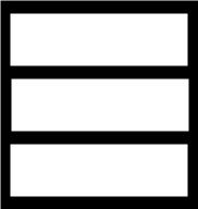
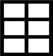
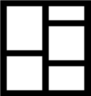
Unlike the ListView, the RecyclerView also provides a choice of three built-in layout managers to control how the list items are presented to the user:
- LinearLayoutManager – The list items are presented as horizontal or vertical scrolling lists.

- GridLayoutManager – The list items are presented in grid format. This manager is best used when the list items are of uniform size.

- StaggeredGridLayoutManager – The list items are presented in a staggered grid format. This manager is best used when the list items are of different sizes.

For situations where none of the three built-in managers provide the necessary layout, custom layout managers may be implemented by subclassing the RecyclerView.LayoutManager class.
Each list item displayed in a RecyclerView is created as an instance of the ViewHolder class. The ViewHolder instance contains everything necessary for the RecyclerView to display the list item, including the information to be displayed and the view layout used to display the item.
As with the ListView, the RecyclerView depends on an adapter to act as the intermediary between the RecyclerView instance and the data to be displayed to the user. The adapter is created as a subclass of the RecyclerView.Adapter class and must, at a minimum, implement the following methods, which will be called at various points by the RecyclerView object to which the adapter is assigned:
- getItemCount() – This method must return a count of the number of items to be displayed in the list.
- onCreateViewHolder() – This method creates and returns a ViewHolder object initialized with the view that is to be used to display the data. This view is typically created by inflating the XML layout file.
- onBindViewHolder() – This method is passed the ViewHolder object created by the onCreateViewHolder() method together with an integer value indicating the list item that is about to be displayed. Contained within the ViewHolder object is the layout assigned by the onCreateViewHolder() method. The onBindViewHolder() method is responsible for populating the views in the layout with the text and graphics corresponding to the specified item and returning the object to the RecyclerView, where it will be presented to the user.
Adding a RecyclerView to a layout is a matter of adding the appropriate element to the XML content layout file of the activity in which it is to appear. For example:
<?xml version="1.0" encoding="utf-8"?>
<androidx.constraintlayout.widget.ConstraintLayout
    xmlns:android="http://schemas.android.com/apk/res/android"
    xmlns:app="http://schemas.android.com/apk/res-auto"
    xmlns:tools="http://schemas.android.com/tools"
    android:layout_width="match_parent"
    android:layout_height="match_parent"
    app:layout_behavior="@string/appbar_scrolling_view_behavior"
    tools:context=".MainActivity"
    tools:showIn="@layout/activity_card_demo">

    <androidx.recyclerview.widget.RecyclerView
        android:id="@+id/recycler_view"
        android:layout_width="0dp"
        android:layout_height="0dp"
        app:layout_constraintBottom_toBottomOf="parent"
        app:layout_constraintEnd_toEndOf="parent"
        app:layout_constraintStart_toStartOf="parent"
        app:layout_constraintTop_toTopOf="parent"
        tools:listItem="@layout/card_layout" />

</androidx.constraintlayout.widget.ConstraintLayout>
.
.Code language: HTML, XML (xml)
The RecyclerView has been embedded into the CoordinatorLayout of a main activity layout file along with the AppBar and Toolbar in the above example. This provides some additional features, such as configuring the Toolbar and AppBar to scroll off the screen when the user scrolls up within the RecyclerView (a topic covered in more detail in the chapter entitled “Working with the AppBar and Collapsing Toolbar Layouts”).
An Overview of the CardView
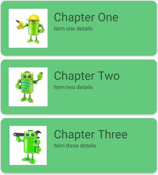
The CardView class is a user interface view that allows information to be presented in groups using a card metaphor. Cards are usually presented in lists using a RecyclerView instance and may be configured to appear with shadow effects and rounded corners. Figure 54-4, for example, shows three CardView instances configured to display a layout consisting of an ImageView and two TextViews:

The user interface layout to be presented with a CardView instance is defined within an XML layout resource file and loaded into the CardView at runtime. The CardView layout can contain a layout of any complexity using the standard layout managers such as RelativeLayout and LinearLayout. The following XML layout file represents a card view layout consisting of a RelativeLayout and a single ImageView. The card is configured to be elevated to create a shadowing effect and to appear with rounded corners:
<?xml version="1.0" encoding="utf-8"?>
    <androidx.cardview.widget.CardView
        xmlns:card_view="http://schemas.android.com/apk/res-auto"
        xmlns:android="http://schemas.android.com/apk/res/android"
        android:id="@+id/card_view"
        android:layout_width="match_parent"
        android:layout_height="wrap_content"
        android:layout_margin="5dp"
        card_view:cardCornerRadius="12dp"
        card_view:cardElevation="3dp"
        card_view:contentPadding="4dp">

        <RelativeLayout
            android:layout_width="match_parent"
            android:layout_height="wrap_content"
            android:padding="16dp" >

            <ImageView
                android:layout_width="100dp"
                android:layout_height="100dp"
                android:id="@+id/item_image"
                android:layout_alignParentLeft="true"
                android:layout_alignParentTop="true"
                android:layout_marginRight="16dp" />
        </RelativeLayout>
</androidx.cardview.widget.CardView>Code language: HTML, XML (xml)
When combined with the RecyclerView to create a scrollable list of cards, the onCreateViewHolder() method of the recycler view inflates the layout resource file for the card, assigns it to the ViewHolder instance and returns it to the RecyclerView instance.
Summary
This chapter has introduced the Android RecyclerView and CardView components. The RecyclerView provides a resource-efficient way to display scrollable lists of views within an Android app. The CardView is useful when presenting groups of data (such as a list of names and addresses) in the form of cards. As previously outlined and demonstrated in the tutorial contained in the next chapter, RecyclerView and CardView are particularly useful when combined.

