The MotionLayout class provides an easy way to add animation effects to the views of a user interface layout. This chapter will begin by providing an overview of MotionLayout and introduce the concepts of MotionScenes, Transitions, and Keyframes. Once these basics have been covered, the next two chapters (entitled An Android Studio MotionLayout Tutorial and An Android Studio MotionLayout KeyCycle Tutorial) will provide additional detail and examples of MotionLayout animation in action through the creation of example projects.
An Overview of MotionLayout
MotionLayout is a layout container, the primary purpose of which is to animate the transition of views within a layout from one state to another. MotionLayout could, for example, animate the motion of an ImageView instance from the top left-hand corner of the screen to the bottom right-hand corner over a specified time. In addition to the position of a view, other attribute changes may also be animated, such as the color, size, or rotation angle. These state changes can also be interpolated (such that a view moves, rotates, and changes size throughout the animation).
The motion of a view using MotionLayout may be performed in a straight line between two points or implemented to follow a path comprising intermediate points at different positions between the start and end points. MotionLayout also supports using touches and swipes to initiate and control animation.
MotionLayout animations are declared entirely in XML and do not typically require writing code. These XML declarations may be implemented manually in the Android Studio code editor, visually using the MotionLayout editor, or combining both approaches.
MotionLayout
When implementing animation, the ConstraintLayout container typically used in a user interface must first be converted to a MotionLayout instance (a task which can be achieved by right-clicking on the ConstraintLayout in the layout editor and selecting the Convert to MotionLayout menu option). MotionLayout also requires at least version 2.0.0 of the ConstraintLayout library.
Unsurprisingly since it is a subclass of ConstraintLayout, MotionLayout supports all of the layout features of the ConstraintLayout. Therefore, a user interface layout can be similarly designed when using MotionLayout for views that do not require animation.
For views that are to be animated, two ConstraintSets are declared, defining the appearance and location of the view at the start and end of the animation. A transition declaration defines keyframes to apply additional effects to the target view between these start and end states and click and swipe handlers used to start and control the animation. The start and end ConstraintSets and the transitions are declared within a MotionScene XML file.
MotionScene
As we have seen in earlier chapters, an XML layout file contains the information necessary to configure the appearance and layout behavior of the static views presented to the user, and this is still the case when using MotionLayout. For non-static views (in other words, the views that will be animated), those views are still declared within the layout file, but the start, end, and transition declarations related to those views are stored in a separate XML file referred to as the MotionScene file (so called because all of the declarations are defined within a MotionScene element). This file is imported into the layout XML file and contains the start and end ConstraintSets and Transition declarations (a single file can contain multiple ConstraintSet pairs and Transition declarations, allowing different animations to be targeted to specific views within the user interface layout). The following listing shows a template for a MotionScene file:
<?xml version="1.0" encoding="utf-8"?>
<MotionScene
    xmlns:android="http://schemas.android.com/apk/res/android"
    xmlns:motion="http://schemas.android.com/apk/res-auto">

    <Transition
        motion:constraintSetEnd="@+id/end"
        motion:constraintSetStart="@id/start"
        motion:duration="1000">
       <KeyFrameSet>
       </KeyFrameSet>
    </Transition>

    <ConstraintSet android:id="@+id/start">
    </ConstraintSet>

    <ConstraintSet android:id="@+id/end">
    </ConstraintSet>
</MotionScene>Code language: HTML, XML (xml)
In the above XML, ConstraintSets named start and end (though any name can be used) have been declared, which, at this point, are yet to contain any constraint elements. The Transition element defines that these ConstraintSets represent the animation start and end points and contain an empty KeyFrameSet element ready to be populated with additional animation keyframe entries. The Transition element also includes a millisecond duration property to control the running time of the animation.
ConstraintSets do not have to imply the motion of a view. It is possible to have the start and end sets declare the same location on the screen and then use the transition to animate other property changes, such as scale and rotation angle.
ConstraintSets do not have to imply the motion of a view. It is possible, for example, to have the start and end sets declare the same location on the screen and then use the transition to animate other property changes, such as scale and rotation angle.
Configuring ConstraintSets
The ConstraintSets in the MotionScene file allow the full set of ConstraintLayout settings to be applied to a view regarding positioning, sizing, and relation to the parent and other views. In addition, the following attributes may also be included within the ConstraintSet declarations:
- alpha
- visibility
- elevation
- rotation
- rotationX
- rotationY
- translationX
- translationY
- translationZ
- scaleX
- scaleY
For example, to rotate the view by 180° during the animation, the following could be declared within the start and end constraints:
<ConstraintSet android:id="@+id/start">
    <Constraint
.
.
        motion:layout_constraintStart_toStartOf="parent"
        android:rotation="0">
    </Constraint>
</ConstraintSet>

<ConstraintSet android:id="@+id/end">
    <Constraint
.
.
        motion:layout_constraintBottom_toBottomOf="parent"
        android:rotation="180">
    </Constraint>
</ConstraintSet>Code language: HTML, XML (xml)
The above changes tell MotionLayout that the view is to start at 0° and then, during the animation, rotate a full 180° before coming to rest upside-down.
Custom Attributes
In addition to the standard attributes listed above, it is possible to specify a range of custom attributes (declared using CustomAttribute). In fact, just about any property available on the view type can be specified as a custom attribute for inclusion in an animation. To identify the attribute’s name, find the getter/setter name from the documentation for the target view class, remove the get/set prefix, and lower the case of the first remaining character. For example, to change the background color of a Button view in code, we might call the setBackgroundColor() setter method as follows:
myButton.setBackgroundColor(Color.RED)Code language: Kotlin (kotlin)When setting this attribute in a constraint set or keyframe, the attribute name will be backgroundColor. In addition to the attribute name, the value must also be declared using the appropriate type from the following list of options:
- motion:customBoolean – Boolean attribute values.
- motion:customColorValue – Color attribute values.
- motion:customDimension – Dimension attribute values.
- motion:customFloatValue – Floating point attribute values.
- motion:customIntegerValue – Integer attribute values.
- motion:customStringValue – String attribute values
For example, a color setting will need to be assigned using the customColorValue type:
<CustomAttribute
    motion:attributeName="backgroundColor"
    motion:customColorValue="#43CC76" />Code language: HTML, XML (xml)
The following excerpt from a MotionScene file, for example, declares start and end constraints for a view in addition to changing the background color from green to red:
.
.
   <ConstraintSet android:id="@+id/start">
        <Constraint
            android:layout_width="wrap_content"
            android:layout_height="wrap_content"
            motion:layout_editor_absoluteX="21dp"
            android:id="@+id/button"
            motion:layout_constraintTop_toTopOf="parent"
            motion:layout_constraintStart_toStartOf="parent" >
            <CustomAttribute
                motion:attributeName="backgroundColor"
                motion:customColorValue="#33CC33" />
        </Constraint>
    </ConstraintSet>

    <ConstraintSet android:id="@+id/end">
        <Constraint
            android:layout_width="wrap_content"
            android:layout_height="wrap_content"
            motion:layout_editor_absoluteY="21dp"
            android:id="@+id/button"
            motion:layout_constraintEnd_toEndOf="parent"
            motion:layout_constraintBottom_toBottomOf="parent" >
            <CustomAttribute
                motion:attributeName="backgroundColor"
                motion:customColorValue="#F80A1F" />
        </Constraint>
    </ConstraintSet>
.
.Code language: HTML, XML (xml)
Triggering an Animation
Without some event to tell MotionLayout to start the animation, none of the settings in the MotionScene file will affect the layout (except that the view will be positioned based on the setting in the start ConstraintSet).
The animation can be configured to start in response to either screen tap (OnClick) or swipe motion (OnSwipe) gesture. The OnClick handler causes the animation to start and run until completion, while OnSwipe will synchronize the animation to move back and forth along the timeline to match the touch motion. The OnSwipe handler will also respond to “flinging” motions on the screen. The OnSwipe handler also provides options to configure how the animation reacts to dragging in different directions and the side of the target view to which the swipe is to be anchored. This allows, for example, left-ward dragging motions to move a view in the corresponding direction while preventing an upward motion from causing a view to move sideways (unless, of course, that is the required behavior).
The OnSwipe and OnClick declarations are contained within the Transition element of a MotionScene file. In both cases, the view id must be specified. For example, to implement an OnSwipe handler responding to downward drag motions anchored to the bottom edge of a view named button, the following XML would be placed in the Transition element:
.
.
<Transition
    motion:constraintSetEnd="@+id/end"
    motion:constraintSetStart="@id/start"
    motion:duration="1000">
   <KeyFrameSet>
   </KeyFrameSet>
    <OnSwipe
        motion:touchAnchorId="@+id/button"
        motion:dragDirection="dragDown"
        motion:touchAnchorSide="bottom" />
</Transition>
.
.Code language: HTML, XML (xml)
Alternatively, to add an OnClick handler to the same button:
<OnClick motion:targetId="@id/button"
    motion:clickAction="toggle" />Code language: HTML, XML (xml)
In the above example, the action has been set to toggle mode. This mode and the other available options can be summarized as follows:
- toggle – Animates to the opposite state. For example, if the view is currently at the transition start point, it will transition to the end point, and vice versa.
- jumpToStart – Changes immediately to the start state without animation.
- jumpToEnd – Changes immediately to the end state without animation.
- transitionToStart – Transitions with animation to the start state.
- transitionToEnd – Transitions with animation to the end state.
Arc Motion
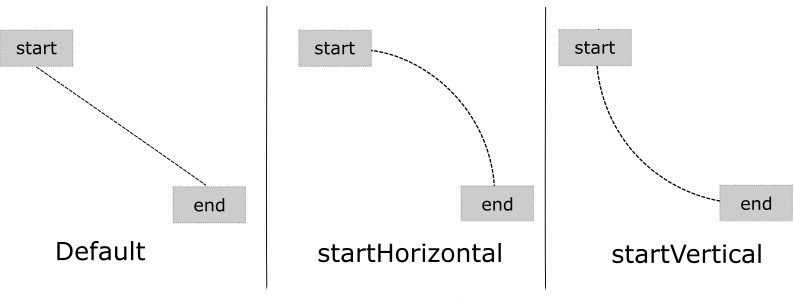
By default, a movement of view position will travel in a straight line between the start and end points. To change the motion to an arc path, use the pathMotionArc attribute as follows within the start constraint, configured with either a startHorizontal or startVertical setting to define whether the arc is to be concave or convex:
<ConstraintSet android:id="@+id/start">
    <Constraint
        android:layout_width="wrap_content"
        android:layout_height="wrap_content"
        motion:layout_editor_absoluteX="21dp"
        android:id="@+id/button"
        motion:layout_constraintTop_toTopOf="parent"
        motion:layout_constraintStart_toStartOf="parent"
        motion:pathMotionArc="startVertical" >Code language: HTML, XML (xml)
Figure 49-1 illustrates startVertical and startHorizontal arcs in comparison to the default straight line motion:
Keyframes
All of the ConstraintSet attributes outlined so far only apply to the start and end points of the animation. In other words, if the rotation property were set to 180° on the end point, the rotation would begin when the animation starts and complete when the end point is reached. It is not, therefore, possible to configure the rotation to reach the full 180° at a point 50% of the way through the animation and then rotate back to the original orientation by the end. Fortunately, this type of effect is available using Keyframes.
Keyframes are used to define intermediate points during the animation at which state changes are to occur. Keyframes could, for example, be declared such that the background color of a view is to have transitioned to blue at a point 50% of the way through the animation, green at the 75% point, and then back to the original color by the end of the animation. Keyframes are implemented within the Transition element of the MotionScene file embedded into the KeyFrameSet element.
MotionLayout supports several types of Keyframe which can be summarized as follows:
Attribute Keyframes
Attribute Keyframes (declared using KeyAttribute) allow view attributes to be changed at intermediate points in the animation timeline. KeyAttribute supports the attributes listed above for ConstraintSets combined with the ability to specify where the change will take effect in the animation timeline. For example, the following Keyframe declaration will gradually cause the button view to double in size horizontally (scaleX) and vertically (scaleY), reaching full size at 50% through the timeline. For the remainder of the timeline, the view will decrease in size to its original dimensions:
<Transition
    motion:constraintSetEnd="@+id/end"
    motion:constraintSetStart="@id/start"
    motion:duration="1000">
   <KeyFrameSet>
       <KeyAttribute
           motion:motionTarget="@+id/button"
           motion:framePosition="50"
           android:scaleX="2.0" />
       <KeyAttribute
           motion:motionTarget="@+id/button"
           motion:framePosition="50"
           android:scaleY="2.0" />
   </KeyFrameSet>Code language: HTML, XML (xml)
Position Keyframes
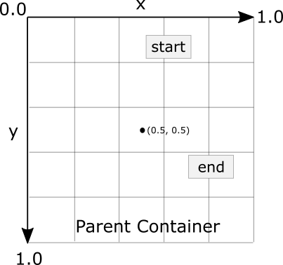
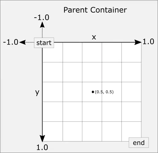
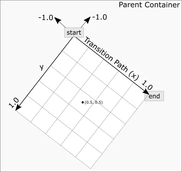
Position keyframes (KeyPosition) modify the path followed by a view as it moves between the start and end locations. By placing key positions at different points on the timeline, a path of just about any level of complexity can be applied to an animation. Positions are declared using x and y coordinates combined with the corresponding points in the transition timeline. These coordinates must be declared relative to one of the following coordinate systems:
- parentRelative – The x and y coordinates are relative to the parent container where the coordinates are specified as a percentage (represented as a value between 0.0 and 1.0):
- deltaRelative – Instead of relative to the parent, the x and y coordinates are relative to the start and end positions. For example, the start point is (0, 0) the end point (1, 1). Keep in mind that the x and y coordinates can be negative values):
- pathRelative – The x and y coordinates are relative to the path, where the straight line between the start and end points serves as the graph’s X-axis. Once again, coordinates are represented as a percentage (0.0 to 1.0). This is similar to the deltaRelative coordinate space but takes into consideration the angle of the path. Once again coordinates may be negative:
As an example, the following ConstraintSets declare start and end points on either side of a device screen. By default, a view transition using these points would move in a straight line across the screen, as illustrated in Figure 49-5:

Suppose, however, that the view is required to follow a path similar to that shown in Figure 49-6 below:
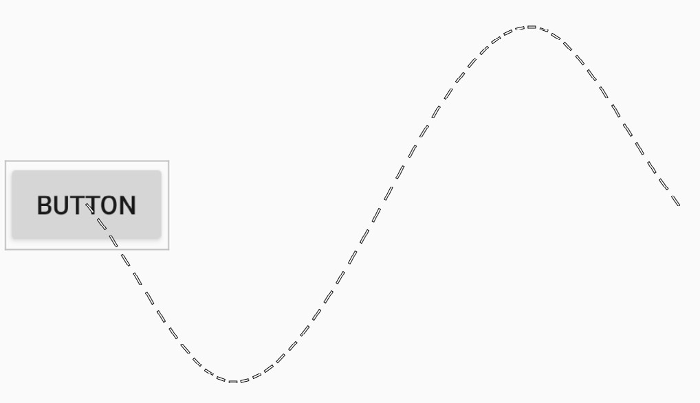
To achieve this, keyframe position points could be declared within the transition as follows:
<KeyPosition
   motion:motionTarget="@+id/button"
   motion:framePosition="25"
   motion:keyPositionType="pathRelative"
   motion:percentY="0.3"
   motion:percentX="0.25"/>

<KeyPosition
   motion:motionTarget="@+id/button"
   motion:framePosition="75"
   motion:keyPositionType="pathRelative"
   motion:percentY="-0.3"
   motion:percentX="0.75"/>Code language: HTML, XML (xml)
The above elements create keyframe position points 25% and 75% through the path using the pathRelative coordinate system. The first position is placed at coordinates (0.25, 0.3) and the second at (0.75, -0.3). These position keyframes can be visualized as illustrated in Figure 49-7 below:

Time Linearity
Without additional settings, the animations outlined above will be performed at a constant speed. To vary the animation speed (for example, so that it accelerates and then decelerates), the transition easing attribute (transitionEasing) can be used within a ConstraintSet or Keyframe.
For complex easing requirements, the linearity can be defined by plotting points on a cubic Bézier curve, for example:
.
.
            motion:layout_constraintBottom_toBottomOf="parent"
            motion:transitionEasing="cubic(0.2, 0.7, 0.3, 1)"
            android:rotation="360">
.
.Code language: HTML, XML (xml)
If you are unfamiliar with Bézier curves, consider using the curve generator online at the following URL:
For most requirements, however, easing can be specified using the built-in standard, accelerate and decelerate values:
.
.
            motion:layout_constraintBottom_toBottomOf="parent"
            motion:transitionEasing="decelerate"
            android:rotation="360">
.
.Code language: HTML, XML (xml)
KeyTrigger
The trigger keyframe (KeyTrigger) allows a method on a view to be called when the animation reaches a specified frame position within the animation timeline. This also takes into consideration the direction of the animations. For example, different methods can be called depending on whether the animation runs forward or backward. Consider a button that is to be made visible when the animation moves beyond 20% of the timeline. The KeyTrigger would be implemented within the KeyFrameSet of the Transition element as follows using the onPositiveCross property:
.
.
    <KeyFrameSet>
           <KeyTrigger
               motion:framePosition="20"
               motion:onPositiveCross="show"
               motion:motionTarget="@id/button"/>
.
.Code language: HTML, XML (xml)
Similarly, if the same button is to be hidden when the animation is reversed and drops below 10%, a second key trigger could be added using the onNegativeCross property:
<KeyTrigger
     motion:framePosition="10"
     motion:onNegativeCross="show"
     motion:motionTarget="@id/button2"/>Code language: HTML, XML (xml)
If the animation is using toggle action, use the onCross property:
<KeyTrigger
     motion:framePosition="10"
     motion:onCross="show"
     motion:motionTarget="@id/button2"/>Code language: HTML, XML (xml)
Cycle and Time Cycle Keyframes
While position keyframes can be used to add intermediate state changes into the animation, this would quickly become cumbersome if large numbers of repetitive positions and changes needed to be implemented. For situations where state changes need to be performed repetitively with predictable changes, MotionLayout includes the Cycle and Time Cycle keyframes. The chapter entitled An Android Studio MotionLayout KeyCycle Tutorial will cover this topic in detail.
Starting an Animation from Code
So far in this chapter, we have only looked at controlling an animation using the OnSwipe and OnClick handlers. It is also possible to start an animation from within code by calling methods on the MotionLayout instance. The following code, for example, runs the transition from start to end with a duration of 2000ms for a layout named motionLayout:
motionLayout.setTransitionDuration(2000)
motionLayout.transitionToEnd()Code language: Kotlin (kotlin)
In the absence of additional settings, the start and end states used for the animation will be those declared in the Transition declaration of the MotionScene file. To use specific start and end constraint sets, reference them by id in a call to the setTransition() method of the MotionLayout instance:
motionLayout.setTransition(R.id.myStart, R.id.myEnd)
motionLayout.transitionToEnd()Code language: Kotlin (kotlin)
To monitor the state of an animation while it is running, add a transition listener to the MotionLayout instance as follows:
motionLayout.setTransitionListener(
    object: MotionLayout.TransitionListener {

        override fun onTransitionTrigger(motionLayout: MotionLayout?,
                    triggerId: Int, positive: Boolean, progress: Float) {
		// Called when a trigger keyframe threshold is crossed
        }

        override fun onTransitionStarted(motionLayout: MotionLayout?,
                    startId: Int, endId: Int) {
		// Called when the transition starts
        }

        override fun onTransitionChange(motionLayout: MotionLayout?,
                    startId: Int, endId: Int, progress: Float) {
		// Called each time a property changes. Track progress value to find
		// current position
        }

        override fun onTransitionCompleted(motionLayout: MotionLayout?,
                                           currentId: Int) {
		// Called when the transition is complete
        }
    })Code language: Kotlin (kotlin)
Summary
MotionLayout is a subclass of ConstraintLayout designed specifically to add animation effects to the views in user interface layouts. MotionLayout works by animating the transition of a view between two states defined by start and end constraint sets. Additional animation effects may be added between these start and end points using keyframes.
Animations may be triggered via OnClick or OnSwipe handlers or programmatically via method calls on the MotionLayout instance.

