It is challenging to think of an Android application concept that does not require some form of user interface. Most Android devices come equipped with a touch screen and keyboard (either virtual or physical), and taps and swipes are the primary interaction between the user and the application. Invariably these interactions take place through the application’s user interface.
A well-designed and implemented user interface, an essential factor in creating a successful and popular Android application, can vary from simple to highly complex, depending on the design requirements of the individual application. Regardless of the level of complexity, the Android Studio Layout Editor tool significantly simplifies the task of designing and implementing Android user interfaces.
Basic vs. Empty Views Activity Templates
As outlined in the chapter entitled Understanding Android App Structure, Android applications comprise one or more activities. An activity is a standalone module of application functionality that usually correlates directly to a single user interface screen. As such, when working with the Android Studio Layout Editor, we are invariably working on the layout for an activity.
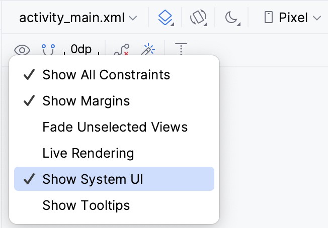
When creating a new Android Studio project, several templates are available to be used as the starting point for the user interface of the main activity. The most basic templates are the Basic Views Activity and Empty Views Activity templates. Although these seem similar at first glance, there are considerable differences between the two options. To see these differences within the layout editor, use the View Options menu to enable Show System UI, as shown in Figure 24-1 below:
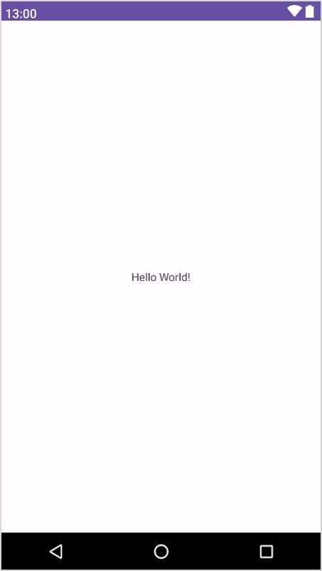
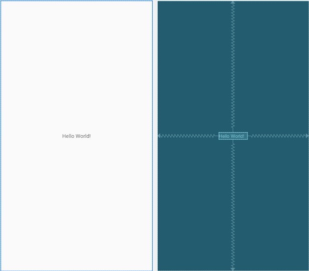
The Empty Views Activity template creates a single layout file consisting of a ConstraintLayout manager instance containing a TextView object, as shown in Figure 24-2:
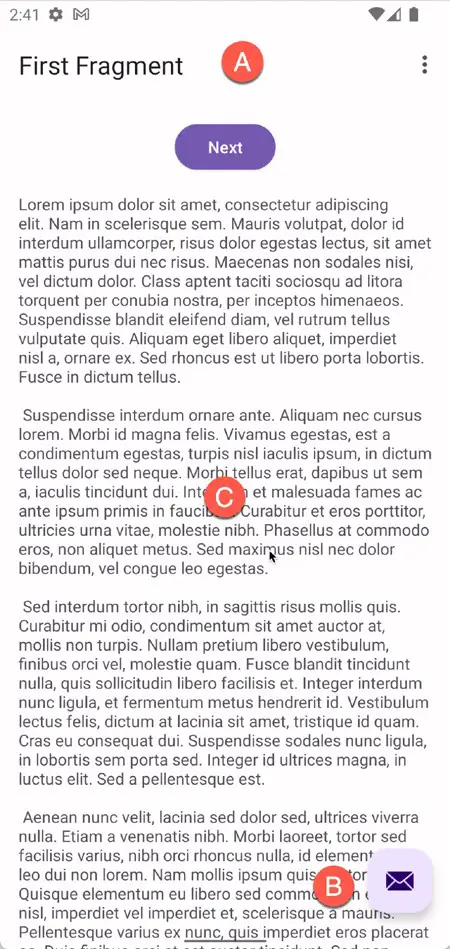
The Basic Views Activity, on the other hand, consists of multiple layout files. The top-level layout file has a CoordinatorLayout as the root view, a configurable app bar (which contains a toolbar) that appears across the top of the device screen (marked A in Figure 24-3), and a floating action button (the email button marked B). In addition to these items, the activity_main.xml layout file contains a reference to a second file named content_ main.xml containing the content layout (marked C):
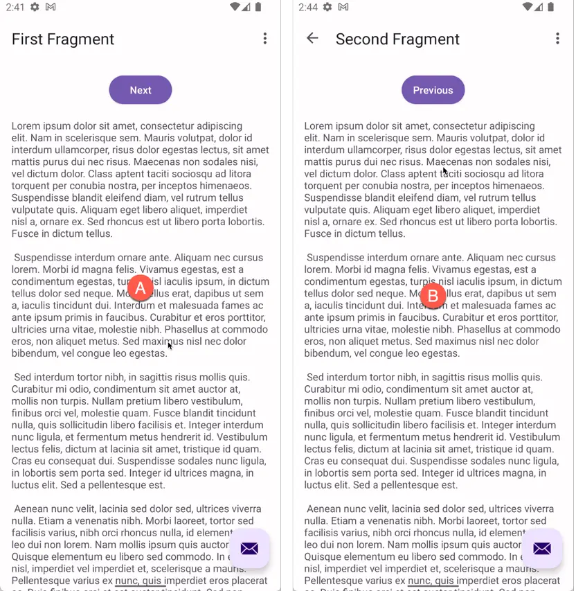
The Basic Views Activity contains layouts for two screens containing a button and a text view. This template aims to demonstrate how to implement navigation between multiple screens within an app. If an unmodified app using the Basic Views Activity template were to be run, the first of these two screens would appear (marked A in Figure 24-4). Pressing the Next button would navigate to the second screen (B), which, in turn, contains a button to return to the first screen:
This app behavior uses of two Android features referred to as fragments and navigation, which will be covered starting with the chapters entitled A Guide to Android Fragments and The Android Navigation Architecture Component respectively.
The content_main.xml file contains a special fragment, known as a Navigation Host Fragment which allows different content to be switched in and out of view depending on the settings configured in the res -> layout -> nav_graph.xml file. In the case of the Basic Views Activity template, the nav_graph.xml file is configured to switch between the user interface layouts defined in the fragment_first.xml and fragment_second.xml files based on the Next and Previous button selections made by the user.
The Empty Views Activity template is helpful if you need neither a floating action button nor a menu in your activity and do not need the special app bar behavior provided by the CoordinatorLayout, such as options to make the app bar and toolbar collapse from view during certain scrolling operations (a topic covered in the chapter entitled The Android AppBar and CollapsingToolbar Layouts). However, the Basic Views Activity is helpful because it provides these elements by default. In fact, it is often quicker to create a new activity using the Basic Views Activity template and delete the elements you do not require than to use the Empty Views Activity template and manually implement behavior such as collapsing toolbars, a menu, or a floating action button.
Since not all of the examples in this book require the features of the Basic Views Activity template, however, most of the examples in this chapter will use the Empty Views Activity template unless the example requires one or other of the features provided by the Basic Views Activity template.
For future reference, if you need a menu but not a floating action button, use the Basic Views Activity and follow these steps to delete the floating action button:
- Double-click on the main activity_main.xml layout file in the Project tool window under app -> res -> layout to load it into the Layout Editor. With the layout loaded into the Layout Editor tool, select the floating action button and tap the keyboard Delete key to remove the object from the layout.
- Locate and edit the Kotlin code for the activity (located under app -> kotlin+java -> <package name> -> <activity class name> and remove the floating action button code from the onCreate method as follows:
override fun onCreate(savedInstanceState: Bundle?) {
    super.onCreate(savedInstanceState)

    binding = ActivityMainBinding.inflate(layoutInflater)
    setContentView(binding.root)

    setSupportActionBar(binding.toolbar)

    val navController = findNavController(R.id.nav_host_fragment_content_main)
    appBarConfiguration = AppBarConfiguration(navController.graph)
    setupActionBarWithNavController(navController, appBarConfiguration)

//   binding.fab.setOnClickListener { view ->
//       Snackbar.make(view, "Replace with your own action", Snackbar.LENGTH_LONG)
//           .setAnchorView(R.id.fab)
//           .setAction("Action", null).show()
    }
}Code language: Kotlin (kotlin)
If you need a floating action button but no menu, use the Basic Views Activity template and follow these steps:
- Edit the main activity class file and delete the onCreateOptionsMenu and onOptionsItemSelected methods.
- Select the res -> menu item in the Project tool window and tap the keyboard Delete key to remove the folder and corresponding menu resource files from the project.
If you need to use the Basic Views Activity template but need neither the navigation features nor the second content fragment, follow these steps:
- Within the Project tool window, navigate to and double-click on the app -> res -> navigation -> nav_graph.xml file to load it into the navigation editor.
- Within the editor, select the SecondFragment entry in the graph panel and tap the keyboard delete key to remove it from the graph.
- Locate and delete the SecondFragment.kt (app -> kotlin+java -> <package name> -> SecondFragment) and fragment_second.xml (app -> res -> layout -> fragment_second.xml) files.
- The final task is to remove some code from the FirstFragment class so that the Button view no longer navigates to the now non-existent second fragment when clicked. Locate the FirstFragment.kt file, double-click on it to load it into the editor, and remove the code from the onViewCreated() method so that it reads as follows:
override fun onViewCreated(view: View, savedInstanceState: Bundle?) {
    super.onViewCreated(view, savedInstanceState)

//    binding.buttonFirst.setOnClickListener {
//        findNavController().navigate(R.id.action_FirstFragment_to_SecondFragment)
    }
}Code language: Kotlin (kotlin)
The Android Studio Layout Editor
As demonstrated in previous chapters, the Layout Editor tool provides a “what you see is what you get” (WYSIWYG) environment in which views can be selected from a palette and then placed onto a canvas representing the display of an Android device. Once a view has been placed on the canvas, it can be moved, deleted, and resized (subject to the constraints of the parent view). Moreover, various properties relating to the selected view may be modified using the Attributes tool window.
Under the surface, the Layout Editor tool constructs an XML resource file containing the definition of the user interface that is being designed. As such, the Layout Editor tool operates in three distinct modes: Design, Code, and Split.
Design Mode
In design mode, the user interface can be visually manipulated by directly working with the view palette and the graphical representation of the layout. Figure 24-5 highlights the key areas of the Android Studio Layout Editor tool in design mode:
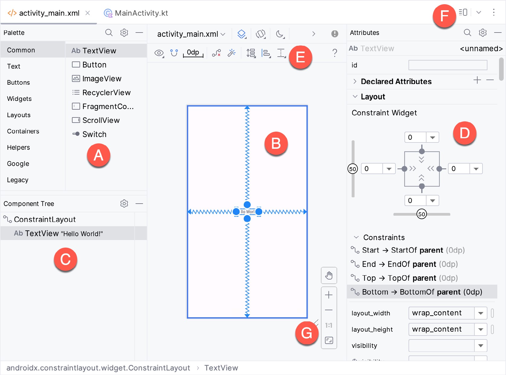
- Palette – The palette provides access to the range of view components the Android SDK provides. These are grouped into categories for easy navigation. Items may be added to the layout by dragging a view component from the palette and dropping it at the desired position on the layout.
- Device Screen – The device screen provides a visual “what you see is what you get” representation of the user interface layout as it is being designed. This layout allows direct design manipulation by allowing views to be selected, deleted, moved, and resized. The device model represented by the layout can be changed anytime using a menu in the toolbar.
- Component Tree – As outlined in the previous chapter (Android Views, View Groups, and Layouts), user interfaces are constructed using a hierarchical structure. The component tree provides a visual overview of the hierarchy of the user interface design. Selecting an element from the component tree will cause the corresponding view in the layout to be selected. Similarly, selecting a view from the device screen layout will select that view in the component tree hierarchy.
- Attributes – All of the component views listed in the palette have associated with them a set of attributes that can be used to adjust the behavior and appearance of that view. The Layout Editor’s attributes panel provides access to the attributes of the currently selected view in the layout allowing changes to be made.
- Toolbar – The Layout Editor toolbar provides quick access to a wide range of options, including, amongst other options, the ability to zoom in and out of the device screen layout, change the device model currently displayed, rotate the layout between portrait and landscape and switch to a different Android SDK API level. The toolbar also has a set of context-sensitive buttons which will appear when relevant view types are selected in the device screen layout.
- Mode Switching Controls – These three buttons provide a way to switch back and forth between the Layout Editor tool’s Design, Code, and Split modes.
- Zoom and Pan Controls – This control panel allows you to zoom in and out of the design canvas, grab the canvas, and pan around to find obscured areas when zoomed in.
The Palette
The Layout Editor palette is organized into two panels designed to make it easy to locate and preview view components for addition to a layout design. The category panel (marked A in Figure 24-6) lists the different categories of view components supported by the Android SDK. When a category is selected from the list, the second panel (B) updates to display a list of the components that fall into that category:
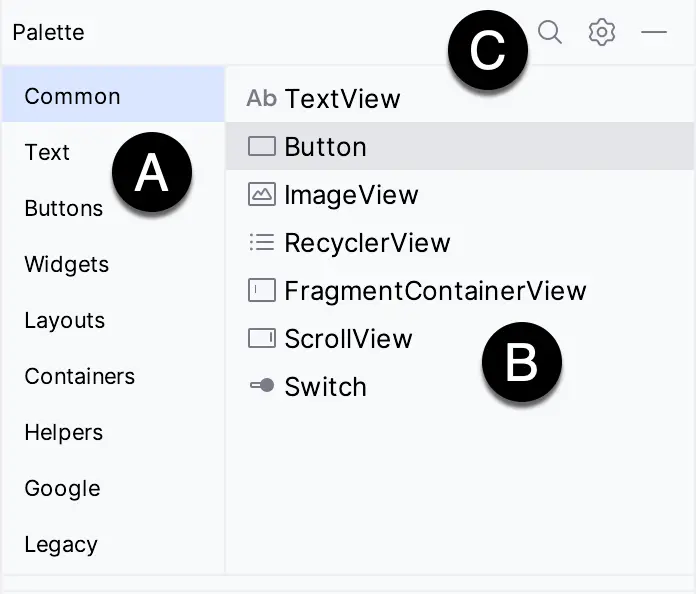
To add a component from the palette onto the layout canvas, select the item from the component list or the preview panel, drag it to the desired location on the canvas, and drop it into place.
A search for a specific component within the selected category may be initiated by clicking the search button (marked C in Figure 24-6 above) in the palette toolbar and typing in the component name. As characters are typed, matching results will appear in the component list panel. If you are unsure of the component’s category, select the All Results category before or during the search operation.
Design Mode and Layout Views
The layout editor will appear in Design mode by default, as shown in Figure 24-5 above. This mode provides a visual representation of the user interface. Design mode can be selected by clicking on the button marked C in Figure 24-7:
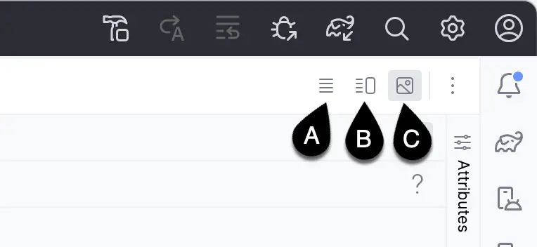
When the Layout Editor tool is in Design mode, the layout can be viewed in two ways. The view shown in Figure 24-5 above is the Design view and shows the layout and widgets as they will appear in the running app. A second mode, the Blueprint view, can be shown instead of or concurrently with the Design view. The toolbar menu in Figure 24-8 provides options to display the Design, Blueprint, or both views. Settings are also available to adjust for color blindness. A fifth option, Force Refresh Layout, causes the layout to rebuild and redraw. This can be useful when the layout enters an unexpected state or is not accurately reflecting the current design settings:
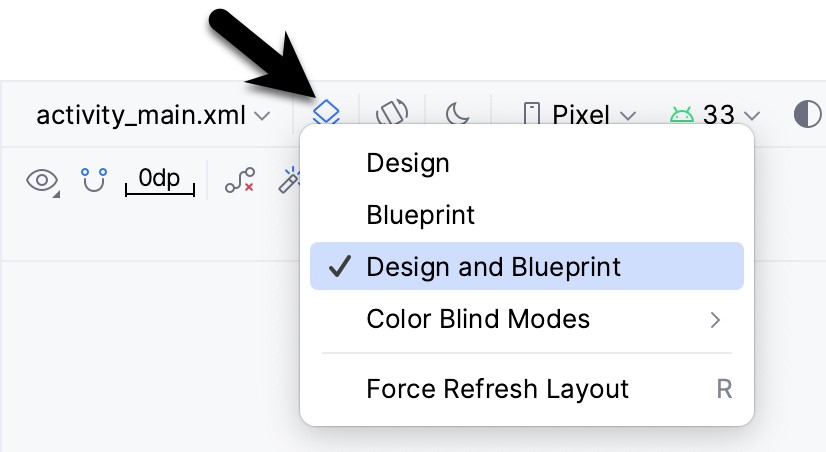
Whether to display the layout view, design view, or both is a matter of personal preference. A good approach is to begin with both displayed as shown in Figure 24-9:
Night Mode
To view the layout in night mode during the design work, select the menu shown in Figure 24-10 below and change the setting to Night:
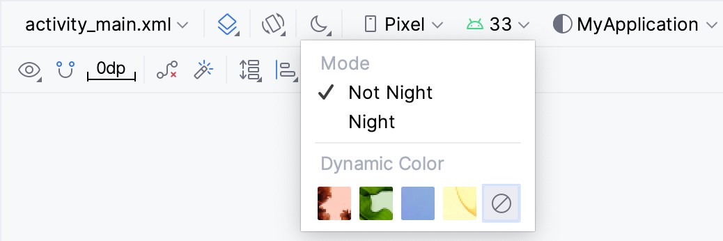
The mode menu also includes options for testing dynamic colors, a topic covered in the chapter Working with Material Design 3 Theming in Android Studio.
Code Mode
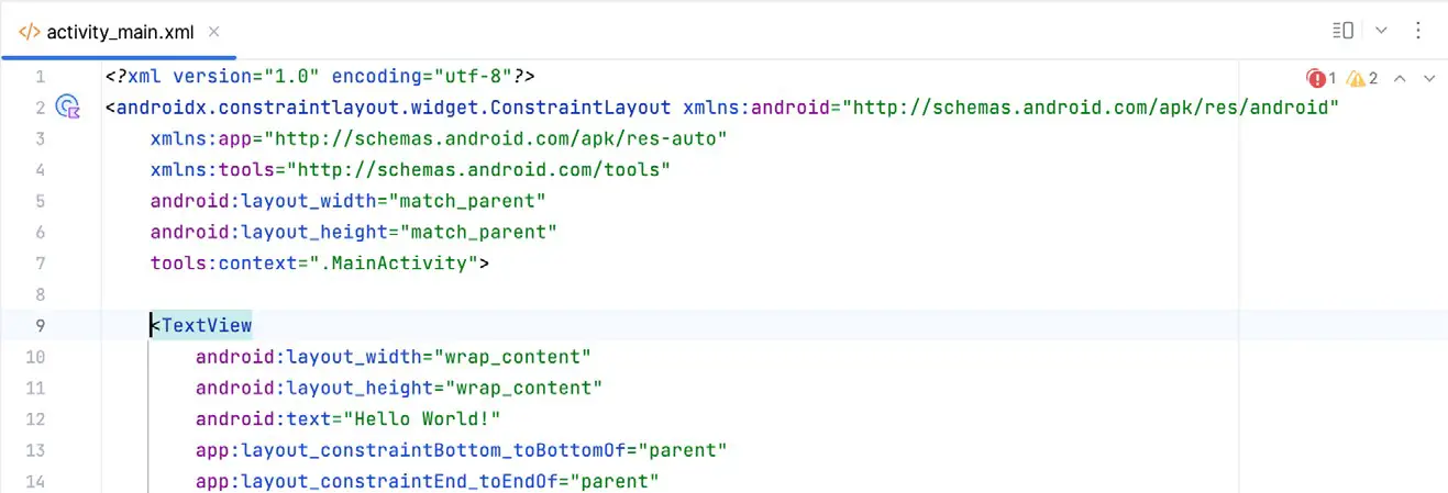
It is important to remember when using the Android Studio Layout Editor tool that all it is doing is providing a user-friendly approach to creating XML layout resource files. The underlying XML can be viewed and directly edited during the design process by selecting the button marked A in Figure 24-7 above.
Figure 24-11 shows the Android Studio Layout Editor tool in Code mode, allowing changes to be made to the user interface declaration by modifying the XML:
Split Mode
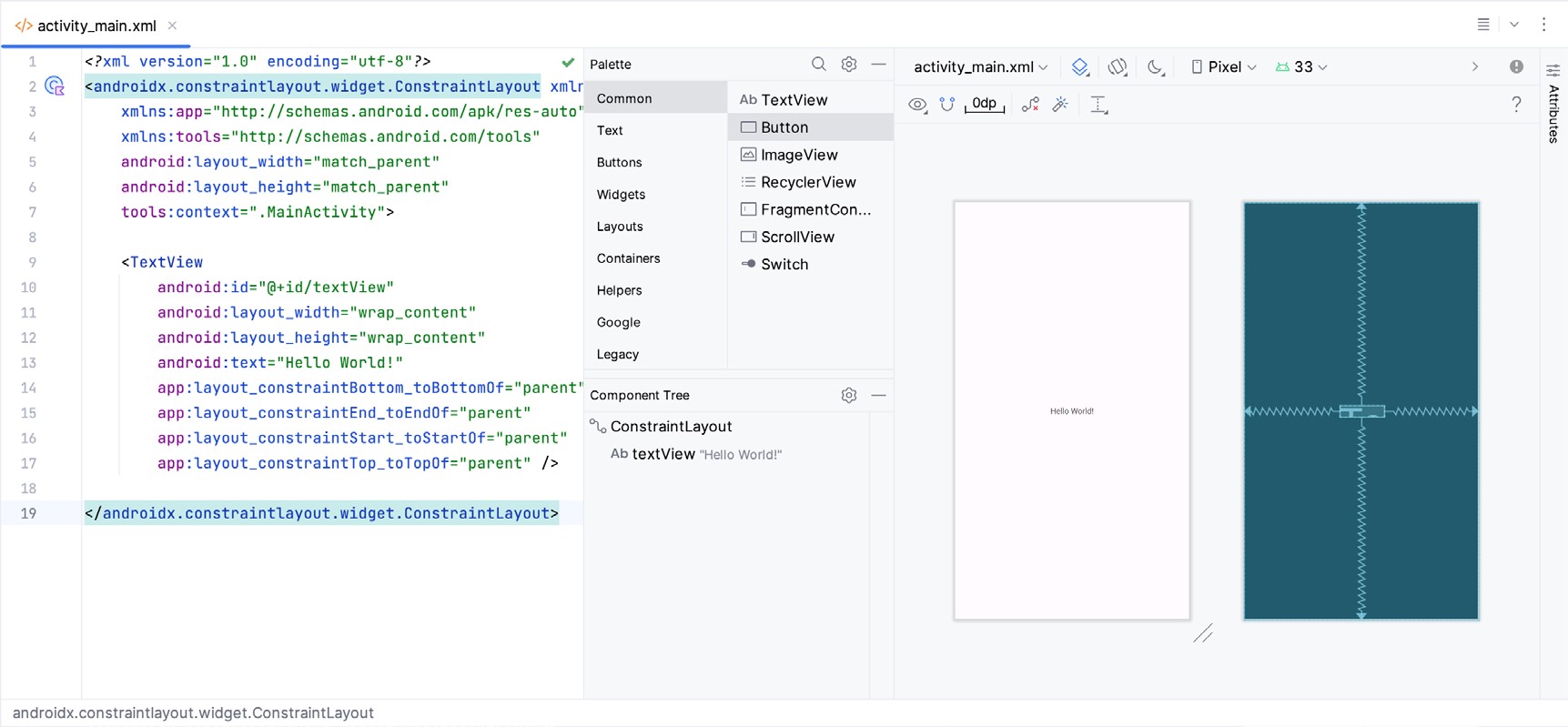
In Split mode, the editor shows the Design and Code views side-by-side, allowing the user interface to be modified visually using the design canvas and making changes directly to the XML declarations. Split mode is selected using the button marked B Figure 24-7 above.
Any changes to the XML are automatically reflected in the design canvas and vice versa. Figure 24-13 shows the editor in Split mode:
Setting Attributes
The Attributes panel provides access to all available settings for the currently selected component. Figure 24-14, for example, shows some of the attributes for the TextView widget:
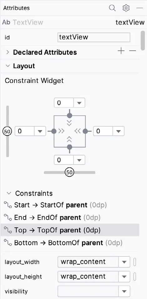
The Attributes tool window is divided into the following different sections.
- id – Contains the id property, which defines the name by which the currently selected object will be referenced in the app’s source code.
- Declared Attributes – Contains all of the properties already assigned a value.
- Layout – The settings that define how the currently selected view object is positioned and sized relative to the screen and other objects in the layout.
- Transforms – Contains controls allowing the currently selected object to be rotated, scaled, and offset.
- Common Attributes – A list of attributes that commonly need to be changed for the class of view object currently selected.
- All Attributes – A complete list of all the attributes available for the currently selected object.
A search for a specific attribute may also be performed by selecting the search button in the toolbar of the attributes tool window and typing in the attribute name.
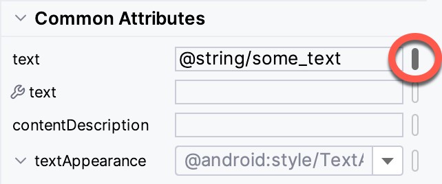
Some attributes contain a narrow button to the right of the value field. This indicates that the Resources dialog is available to assist in selecting a suitable property value. To display the dialog, click on the button. The appearance of this button changes to reflect whether or not the corresponding property value is stored in a resource file or hard-coded. If the value is stored in a resource file, the button to the right of the text property field will be filled in to indicate that the value is not hard-coded, as highlighted in Figure 24-15 below:
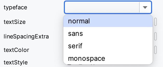
Attributes for which a finite number of valid options are available will present a drop-down menu (Figure 24-16) from which a selection may be made.
A dropper icon can be clicked to display the color selection palette. Similarly, when a flag icon appears, it can be clicked to display a list of options available for the attribute, while an image icon opens the resource manager panel allowing images and other resource types to be selected for the attribute.
Transforms
The transforms panel within the Attributes tool window (Figure 24-17) provides a set of controls and properties that control visual aspects of the currently selected object in terms of rotation, alpha (used to fade a view in and out), scale (size), and translation (offset from current position):
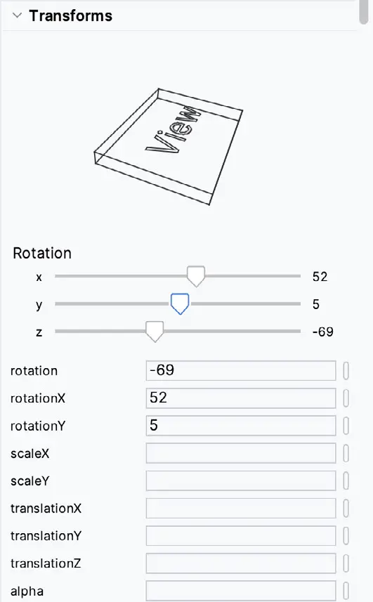
The panel contains a visual representation of the view, which updates as properties are changed. These changes are also reflected in the view within the layout canvas.
Tools Visibility Toggles
When reviewing the content of an Android Studio XML layout file in Code mode, you will notice that many attributes that define how a view appears and behaves begin with the android: prefix. This indicates that the attributes are set within the android namespace and will take effect when the app is run. The following excerpt from a layout file, for example, sets a variety of attributes on a Button view:
<Button
    android:id="@+id/button"
    android:layout_width="wrap_content"
    android:layout_height="wrap_content"
    android:text="Button"
.
.Code language: HTML, XML (xml)
In addition to the android namespace, Android Studio also provides a tools namespace. When attributes are set within this namespace, they only take effect within the layout editor preview. While designing a layout, you might find it helpful for an EditText view to display some text but require the view to be blank when the app runs. To achieve this, you would set the text property of the view using the tools namespace as follows:
<EditText
    android:id="@+id/editTextTextPersonName"
    android:layout_width="wrap_content"
    android:layout_height="wrap_content"
    android:ems="10"
    android:inputType="textPersonName"
    tools:text="Sample Text"
.
.Code language: HTML, XML (xml)
A tool attribute of this type is set in the Attributes tool window by entering the value into the property fields marked by the wrench icon, as shown in Figure 24-18:

Tools attributes are particularly useful for changing the visibility of a view during the design process. A layout may contain a view that is programmatically displayed and hidden when the app runs, depending on user actions. To simulate the hiding of the view, the following tools attribute could be added to the view XML declaration:
tools:visibility="invisible"Code language: HTML, XML (xml)Although the view will no longer be visible when using the invisible setting, it is still present in the layout and occupies the same space it did when it was visible. To make the layout behave as though the view no longer exists, the visibility attribute should be set to gone as follows:
tools:visibility="gone"Code language: HTML, XML (xml)In both examples above, the visibility settings only apply within the layout editor and will have no effect in the running app. To control visibility in both the layout editor and running app, the same attribute would be set using the android namespace:
android:visibility="gone"Code language: HTML, XML (xml)While these visibility tools attributes are useful, having to manually edit the XML layout file is a cumbersome process. To make it easier to change these settings, Android Studio provides a set of toggles within the layout editor Component Tree panel. To access these controls, click in the margin to the right of the corresponding view in the panel. Figure 24-19, for example, shows the tools visibility toggle controls for a Button view named myButton:

These toggles control the visibility of the corresponding view for both the android and tools namespaces and provide not set, visible, invisible and gone options. When conflicting attributes are set (for example, an android namespace toggle is set to visible while the tools value is set to invisible), the tools namespace takes precedence within the layout preview. When a toggle selection is made, Android Studio automatically adds the appropriate attribute to the XML view element in the layout file.
In addition to the visibility toggles in the Component Tree panel, the layout editor also includes the tools visibility and position toggle button shown highlighted in Figure 24-20 below:
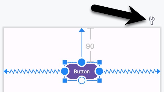
This button toggles the current tools visibility settings. If the Button view shown above currently has the tools visibility attribute set to gone, for example, toggling this button will make it visible. This makes it easy to quickly check the layout behavior as the view is added to and removed from the layout. This toggle is also useful for checking that the views in the layout are correctly constrained, a topic covered in the chapter entitled “A Guide to Using ConstraintLayout in Android Studio”.
Converting Views
Changing a view in a layout from one type to another (such as converting a TextView to an EditText) can be performed easily within the Android Studio layout editor simply by right-clicking on the view either within the screen layout or Component tree window and selecting the Convert view… menu option (Figure 24-21):
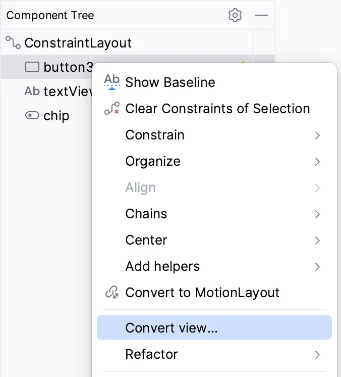
Once selected, a dialog containing a list of compatible view types to which the selected object is eligible for conversion will appear. Figure 24-22, for example, shows the types to which an existing TextView view may be converted:
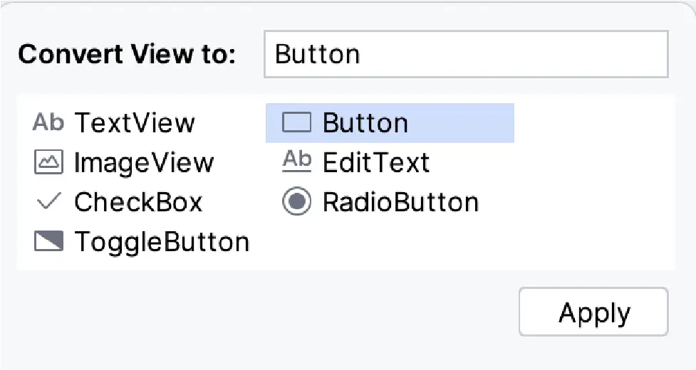
This technique is also helpful in converting layouts from one type to another (for example, converting a ConstraintLayout to a LinearLayout).
Displaying Sample Data
When designing layouts in Android Studio, situations will arise where the content to be displayed within the user interface will not be available until the app is completed and running. This can sometimes make it difficult to assess how the layout will appear at app runtime from within the layout editor. To address this issue, the layout editor allows sample data to be specified, which will populate views within the layout editor with sample images and data. This sample data only appears within the layout editor and is not displayed when the app runs. Sample data may be configured either by directly editing the XML for the layout or visually using the design-time helper by right-clicking on the widget in the design area and selecting the Set Sample Data menu option. The design-time helper panel will display a range of preconfigured options for sample data to be displayed on the selected view item, including combinations of text and images in various configurations. Figure 24-23, for example, shows the sample data options displayed when selecting sample data to appear in a RecyclerView list:
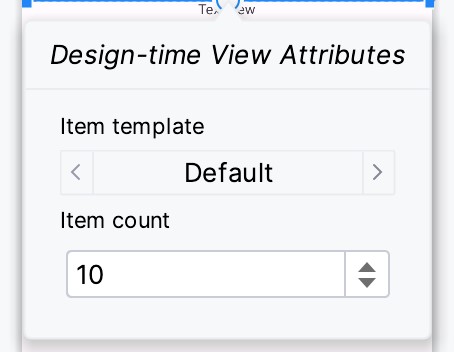
Alternatively, custom text and images may be provided for display during the layout design process. Since sample data is implemented as a tools attribute, the visibility of the data within the preview can be controlled using the toggle button highlighted in Figure 24-20 above.
Creating a Custom Device Definition
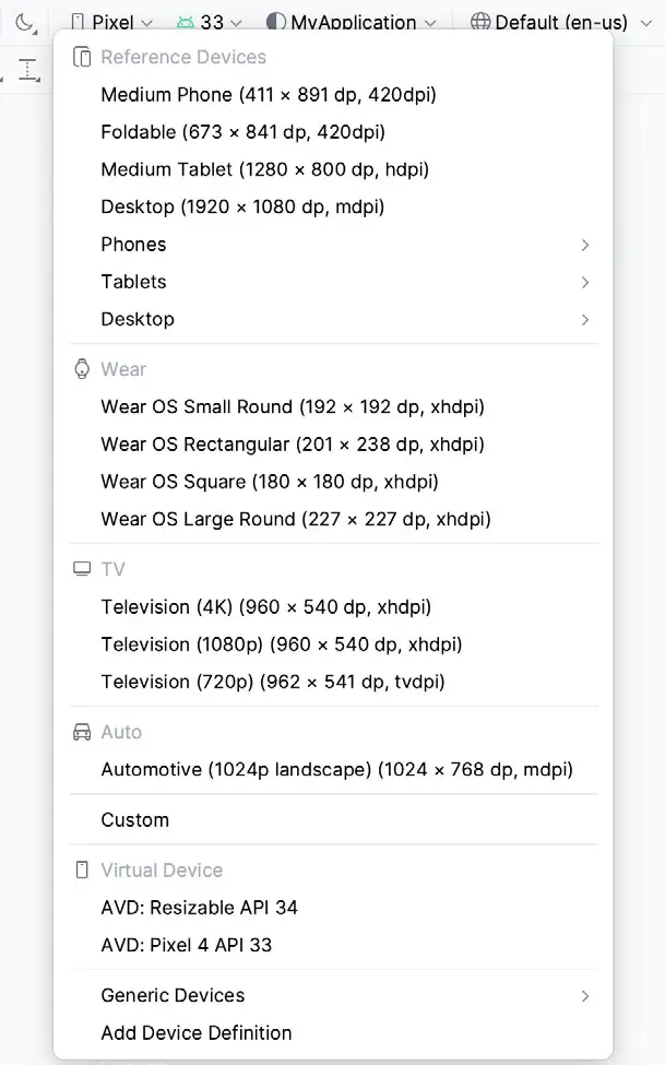
The device menu in the Layout Editor toolbar (Figure 24-24) provides a list of pre-configured device types, which, when selected, will appear as the device screen canvas. In addition to the pre-configured device types, any AVD instances previously configured within the Android Studio environment will also be listed within the menu. To add additional device configurations, display the device menu, select the Add Device Definition option and follow the steps outlined in the chapter entitled Creating an Android Virtual Device (AVD) in Android Studio.
Changing the Current Device
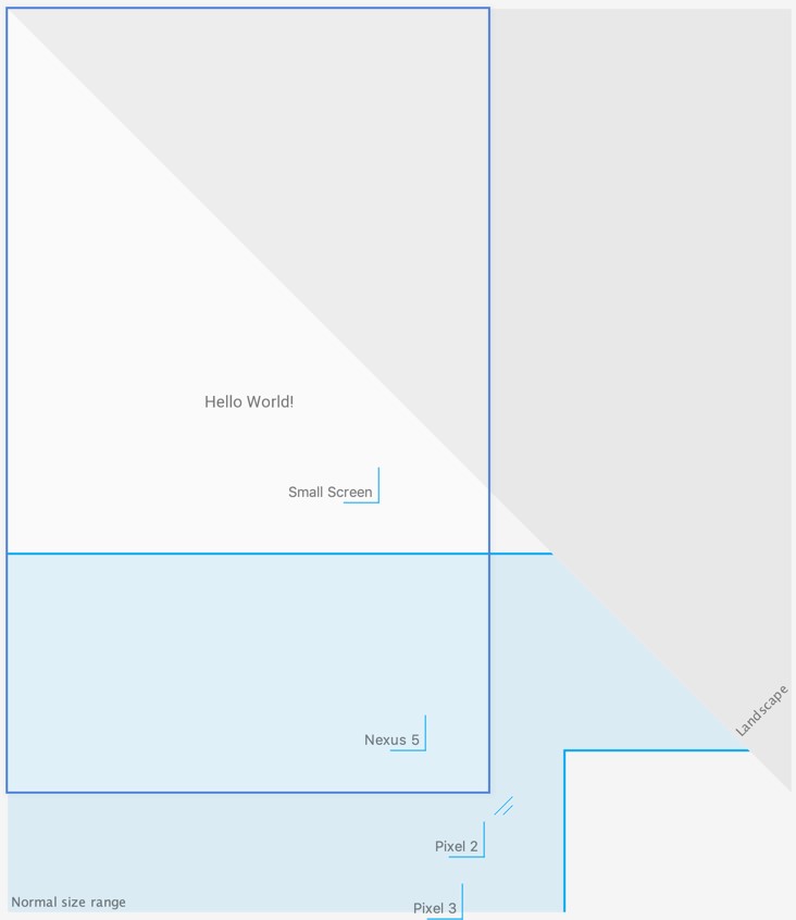
As an alternative to the device selection menu, the current device format may be changed by selecting the Custom option from the device menu, clicking on the resize handle located next to the bottom right-hand corner of the device screen (Figure 24-25), and dragging to select an alternate device display format. As the screen resizes, markers will appear indicating the various size options and orientations available for selection:
Layout Validation
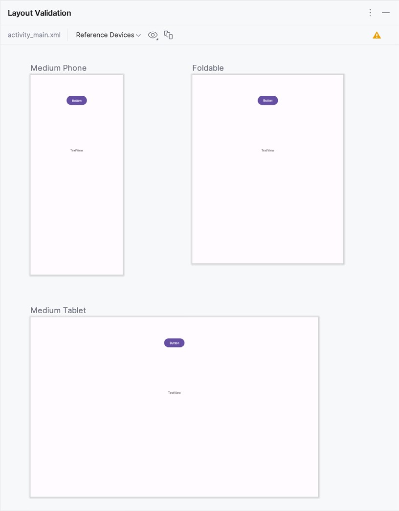
The layout validation option allows the user interface layout to be previewed simultaneously on a range of Pixel-sized screens. To access the layout validation tool window, click on the tab on the right-hand edge of the Android Studio main window or use the Tool Window menu in the bottom left-hand corner of the window. Once loaded, the panel will appear as shown in Figure 24-26, with the layout rendered on multiple device screen configurations:
Summary
A key part of developing Android applications involves the creation of the user interface. This is performed within the Android Studio environment using the Layout Editor tool, which operates in three modes. In Design mode, view components are selected from a palette, positioned on a layout representing an Android device screen, and configured using a list of attributes. The underlying XML representing the user interface layout can be directly edited in Code mode. Split mode, on the other hand, allows the layout to be created and modified both visually and via direct XML editing. These modes combine to provide an extensive and intuitive user interface design environment.
The layout validation panel allows user interface layouts to be quickly previewed on various device screen sizes.

