With the possible exception of listening to streaming audio, a user’s interaction with an Android device is primarily visual and tactile. All of this interaction occurs through the user interfaces of the applications installed on the device, including both the built-in applications and any third-party applications installed by the user. Therefore, it should come as no surprise that a critical element of developing Android applications involves designing and creating user interfaces.
This chapter covers the Android user interface structure, including an overview of the elements that can be combined to make up a user interface: Views, View Groups, and Layouts.
Designing for Different Android Devices
The term “Android device” covers many tablet and smartphone products with different screen sizes and resolutions. As a result, application user interfaces must now be carefully designed to ensure correct presentation on as wide a range of display sizes as possible. A key part of this is ensuring that the user interface layouts resize correctly when run on different devices. This can largely be achieved through careful planning and using the layout managers outlined in this chapter.
It is also essential to remember that most Android-based smartphones and tablets can be held by the user in both portrait and landscape orientations. A well-designed user interface should be able to adapt to such changes and make sensible layout adjustments to utilize the available screen space in each orientation.
Views and View Groups
Every item in a user interface is a subclass of the Android View class (to be precise android.view.View). The Android SDK provides a set of pre-built views that can be used to construct a user interface. Typical examples include standard items such as the Button, CheckBox, ProgressBar, and TextView classes. Such views are also referred to as widgets or components. For requirements not met by the widgets supplied with the SDK, new views may be created by subclassing and extending an existing class or creating an entirely new component by building directly on top of the View class.
A view can also comprise multiple other views (otherwise known as a composite view). Such views are subclassed from the Android ViewGroup class (android.view.ViewGroup), which is itself a subclass of View. An example of such a view is the RadioGroup, which is intended to contain multiple RadioButton objects such that only one can be in the “on” position at any one time. Regarding structure, composite views consist of a single parent view (derived from the ViewGroup class and otherwise known as a container view or root element) capable of containing other views (known as child views). Another category of ViewGroup-based container view is that of the layout manager.
Android Layout Managers
In addition to the widget style views discussed in the previous section, the SDK also includes a set of views referred to as layouts. Layouts are container views (and, therefore, subclassed from ViewGroup) designed to control how child views are positioned on the screen.
The Android SDK includes the following layout views that may be used within an Android user interface design:
- ConstraintLayout – Introduced in Android 7, this layout manager is recommended for most layout requirements. ConstraintLayout allows the positioning and behavior of the views in a layout to be defined by simple constraint settings assigned to each child view. The flexibility of this layout allows complex layouts to be quickly and easily created without the necessity to nest other layout types inside each other, resulting in improved layout performance. ConstraintLayout is also tightly integrated into the Android Studio Layout Editor tool. Unless otherwise stated, this is the layout of choice for most examples in this book.
- LinearLayout – Positions child views in a single row or column depending on the orientation selected. A weight value can be set on each child to specify how much of the layout space that child should occupy relative to other children.
- TableLayout – Arranges child views into a grid format of rows and columns. Each row within a table is represented by a TableRow object child, which, in turn, contains a view object for each cell.
- FrameLayout – The purpose of the FrameLayout is to allocate an area of the screen, typically to display a single view. If multiple child views are added, they will, by default, appear on top of each other and be positioned in the top left-hand corner of the layout area. Alternate positioning of individual child views can be achieved by setting gravity values on each child. For example, setting a center_vertical gravity value on a child will cause it to be positioned in the vertical center of the containing FrameLayout view.
- RelativeLayout – The RelativeLayout allows child views to be positioned relative to each other and the containing layout view through the specification of alignments and margins on child views. For example, child View A may be configured to be positioned in the vertical and horizontal center of the containing RelativeLayout view. View B, on the other hand, might also be configured to be centered horizontally within the layout view but positioned 30 pixels above the top edge of View A, thereby making the vertical position relative to that of View A. The RelativeLayout manager can be helpful when designing a user interface that must work on various screen sizes and orientations.
- AbsoluteLayout – Allows child views to be positioned at specific X and Y coordinates within the containing layout view. Using this layout is discouraged since it lacks the flexibility to respond to screen size and orientation changes.
- GridLayout – A GridLayout instance is divided by invisible lines that form a grid containing rows and columns of cells. Child views are then placed in cells and may be configured to cover multiple cells horizontally and vertically, allowing a wide range of layout options to be quickly and easily implemented. Gaps between components in a GridLayout may be implemented by placing a special type of view called a Space view into adjacent cells or setting margin parameters.
- CoordinatorLayout – Introduced as part of the Android Design Support Library with Android 5.0, the CoordinatorLayout is designed specifically for coordinating the appearance and behavior of the app bar across the top of an application screen with other view elements. When creating a new activity using the Basic Views Activity template, the parent view in the main layout will be implemented using a CoordinatorLayout instance. This layout manager will be covered in greater detail, starting with the chapter “Working with the Floating Action Button and Snackbar”.
When considering layouts in the user interface for an Android application, it is worth keeping in mind that, as outlined in the next section, these can be nested within each other to create a user interface design of just about any necessary level of complexity.
The View Hierarchy
Each view in a user interface represents a rectangular area of the display. A view is responsible for what is drawn in that rectangle and responding to events within that part of the screen (such as a touch event).
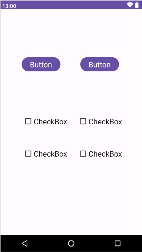
A user interface screen comprises a view hierarchy with a root view positioned at the top of the tree and child views positioned on branches below. The child of a container view appears on top of its parent view and is constrained to appear within the bounds of the parent view’s display area. Consider, for example, the user interface illustrated in Figure 23-1:

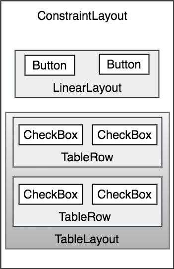
In addition to the visible button and checkbox views, the user interface includes several layout views that control how the visible views are positioned. Figure 23-2 shows an alternative view of the user interface, this time highlighting the presence of the layout views in relation to the child views:

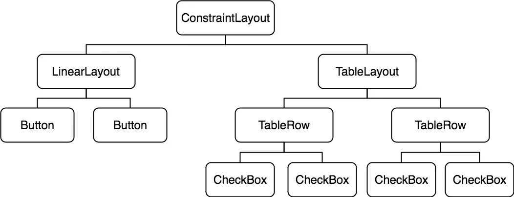
As previously discussed, user interfaces are constructed as a view hierarchy with a root view at the top. This being the case, we can also visualize the above user interface example in the form of the view tree illustrated in Figure 23-3:

The view hierarchy diagram gives the clearest overview of the relationship between the various views that comprise the user interface shown in Figure 23-1. When a user interface is displayed, the Android runtime walks the view hierarchy, starting at the root view and working down the tree as it renders each view.
Creating User Interfaces
With a clearer understanding of the concepts of views, layouts, and the view hierarchy, the following chapters will focus on the steps involved in creating user interfaces for Android activities. In fact, there are three different approaches to user interface design: using the Android Studio Layout Editor tool, handwriting XML layout resource files, or writing Kotlin code, each of which will be covered.
Summary
Each element within a user interface screen of an Android application is a view that is ultimately subclassed from the android.view.View class. Each view represents a rectangular area of the device display and is responsible for what appears in that rectangle and for handling events within the view’s bounds. Multiple views may be combined to create a single composite view. The views within a composite view are children of a container view which is generally a subclass of android.view.ViewGroup (which is itself a subclass of android.view.View). A user interface comprises views constructed in the form of a view hierarchy.
The Android SDK includes a range of pre-built views that can be used to create a user interface. These include basic components such as text fields and buttons, in addition to a range of layout managers that can be used to control the positioning of child views. The Android SDK includes a range of pre-built views that can be used to create a user interface. These include basic components such as text fields and buttons and a range of layout managers that can be used to control the positioning of child views. If the supplied views do not meet a specific requirement, custom views may be created by extending or combining existing views or by subclassing android. view.View and creating an entirely new class of view.
User interfaces may be created using the Android Studio Layout Editor tool, handwriting XML layout resource files, or by writing Kotlin code. Each of these approaches will be covered in the chapters that follow.

